The 5 Spot /// Show Flyer
My old friend Emily Kidd came at me with a commission recently for a show her and her crew had coming up out in Nashville. I’ve designed a ton of posters over the years, most recently being my unsolicited Skylark Social Club one-off, so I was revved at the chance to do another one. This time time was especially fun, since Emily gave me the freedom to run with what I’m calling my Personal Style Apparent.
Ya see, often times when I’m given a job it’s typically centered around a specifically-themed event. Duh, right? What I mean is, the event itself will kind of dictate the aesthetic of the poster. A football-centric event will need to have a load of sporty stuff thrown in. An arts festival will need to be…arty. You get the idea. But with this show, Emily gave me the green light to let loose with whatever imagery I wanted. I still kept it grounded with some folk-music elements, but overall it meant I could grunge it up as I tend to enjoy doing. And what else do I enjoy these days?
! AI ART !
〰️
HELL YEAH
〰️
! AI ART ! 〰️ HELL YEAH 〰️


You know I had to use this sucker. I’ve been highly interested in using AI art as a supplement for graphic design projects. It’s such a quick and easy way to generate customized, specific imagery for whatever purpose you need. It’s been a much more enjoyable and time-saving experience rather than my old go-to method of browsing through hundreds of stock photos to find one halfway-decent background image.
Any who, I had this idea of using a ghostly cowboy strumming an acoustic guitar as the central image. Who knows where that came from, but I ran a few prompts and the robots spat out some neat pieces. Some abstract, some more literal. Many were just…strange. But strange can be cool.
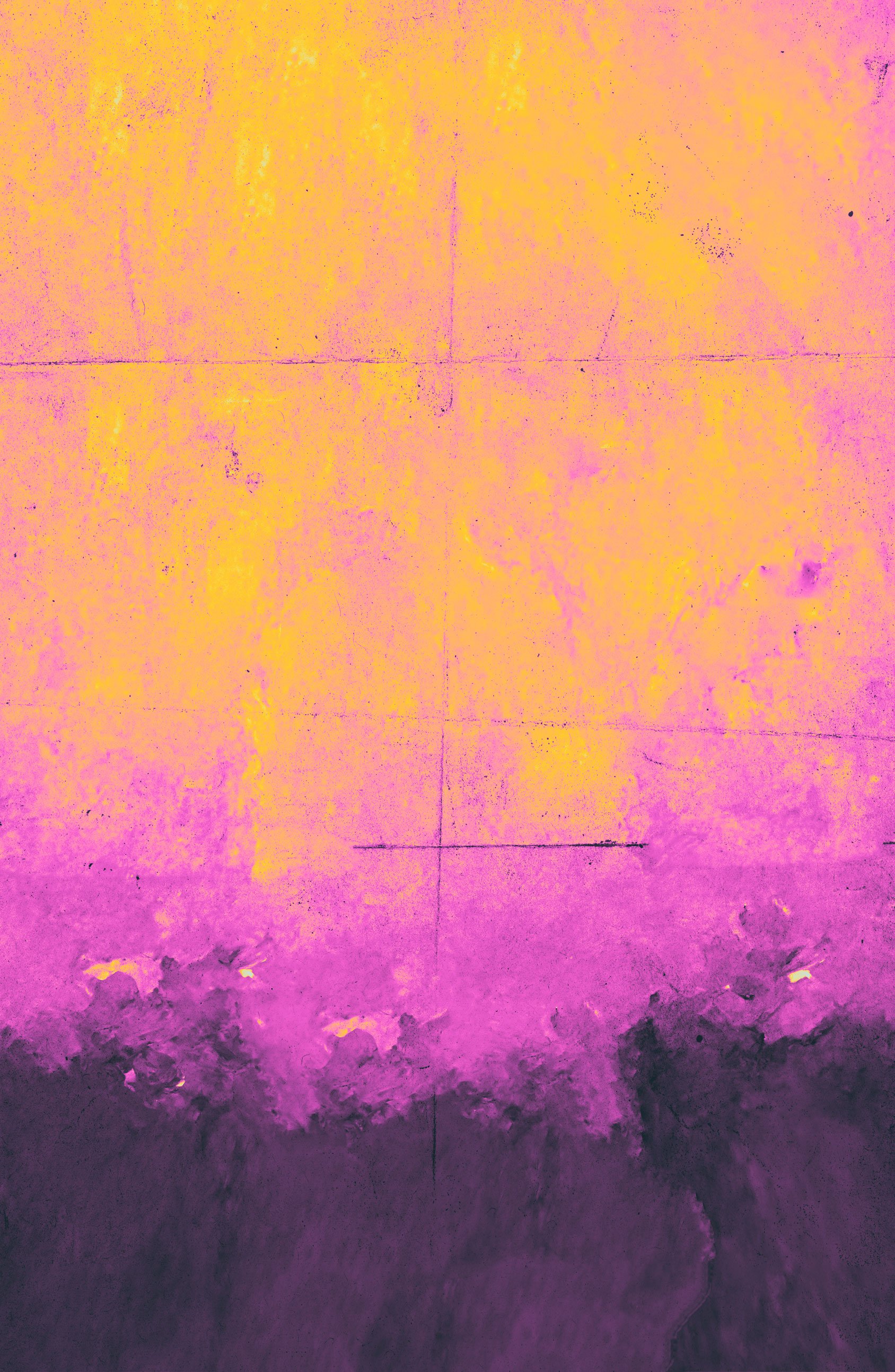
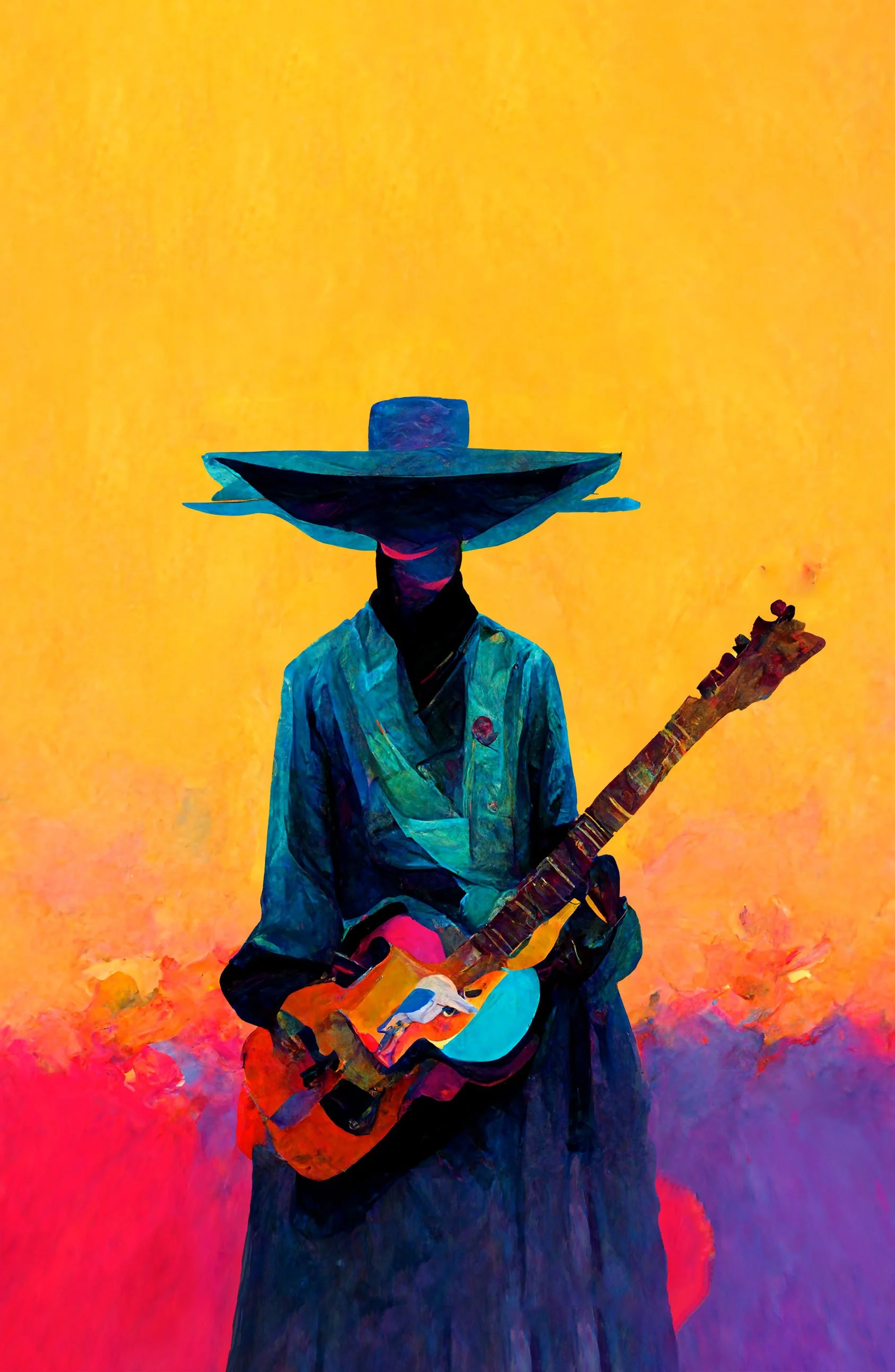

After fiddling with the background base, and doing some minor photomanipulation to the AI-image, I felt I had a good foundation for the type. With it being in this grunge-style it felt right to have the type look handwritten and scrawled. From what I know, The 5 Spot has a bit of a divey vibe, so this kind of shabby, hand-made approach felt right in-line with that. Also, being a big fan of Gradient Maps led me to create an interesting yellow/magenta palette for this version in particular.
The approved final version used a different layout and color scheme, but overall had a similar composition. Central focal point, wraparound text, and a g-map to tie it all together.
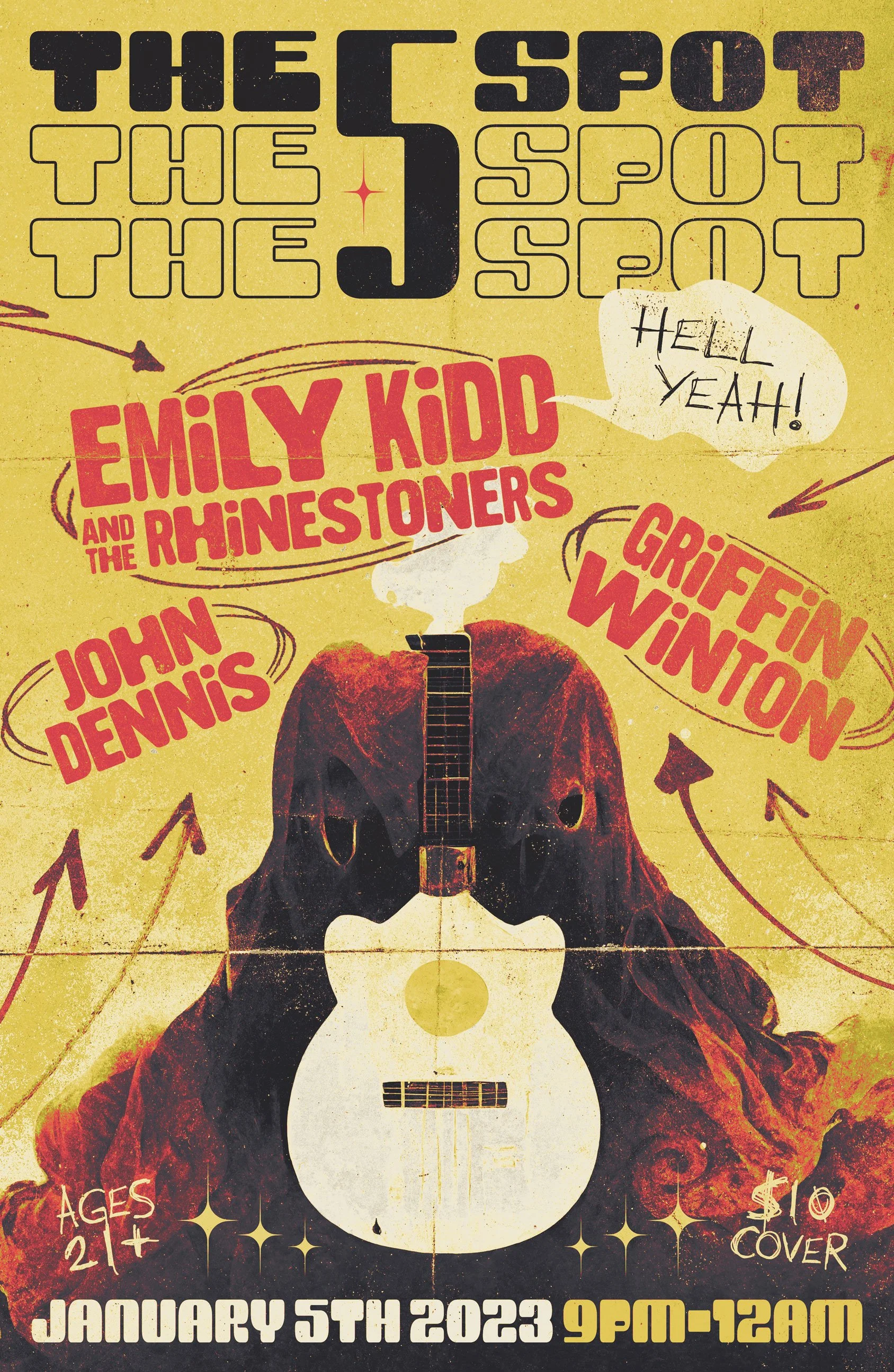
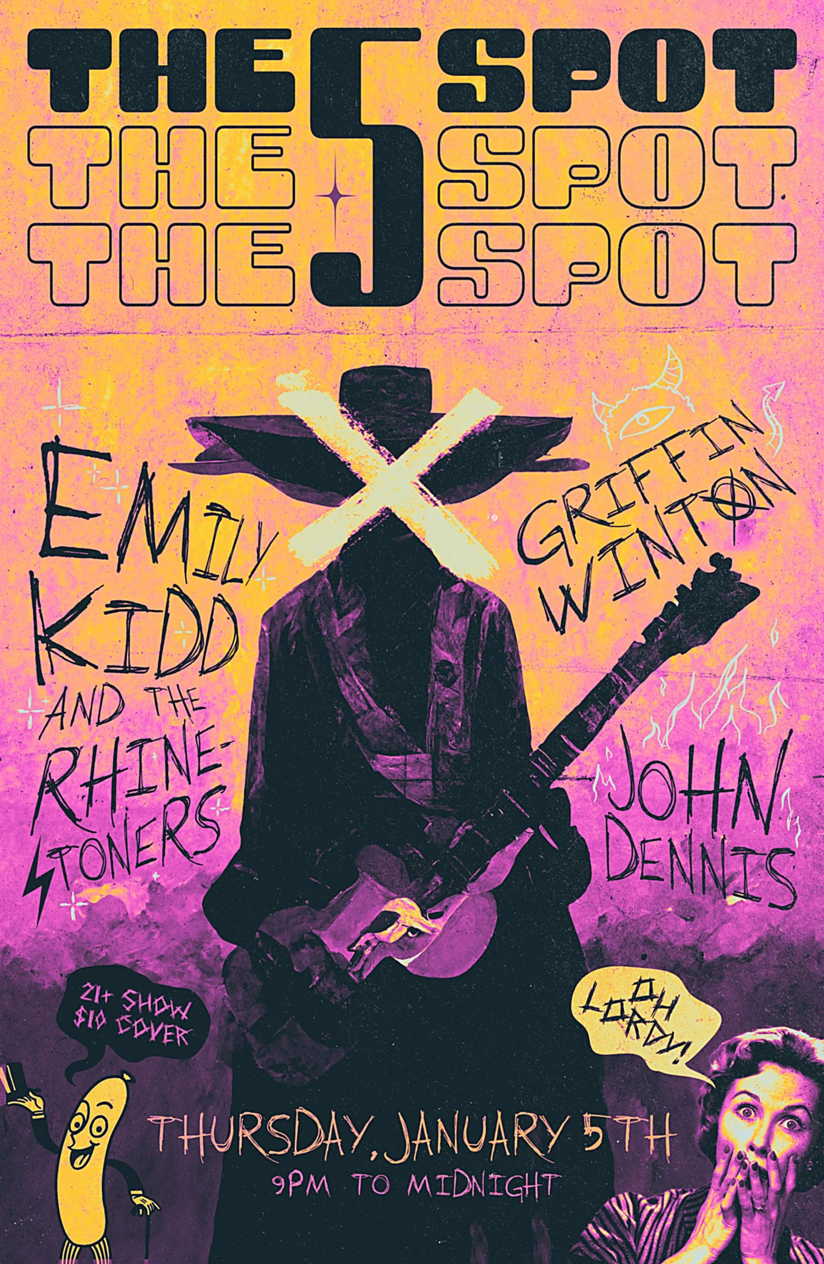
Boom, the final two iterations. The one on the left was ultimately the selected favorite with little to no edits or revisions needed. I feel the first one has better legibility when it comes to the type treatment, and also allows the viewer some breathing room when it comes to the spacing of things. The second, which I think is the most aligned with My Style, comes in a bit hotter with it’s wild typeface and busier composition. I think they both maintain some discernible hierarchy and readability, and I’m grateful that Emily was happy with the work that was done.