Buddha's Bazaar
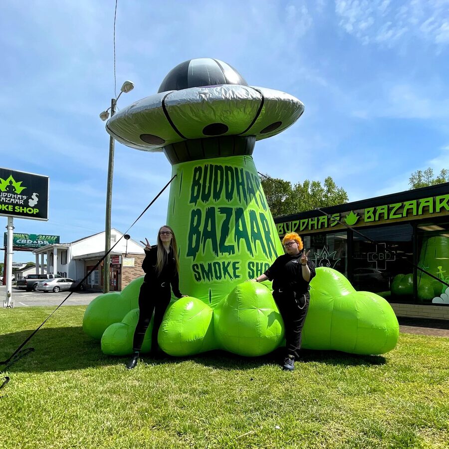
Buddha's Bazaar is a chain of five counterculture variety stores around Charlotte: glass, botanicals, vapes, and everything in between. It was the biggest brand in the Technicals and Posh roster and my longest-running one. I started on it straight out of college and stayed with it for eight years, and somewhere along the way the job grew well past "designer."
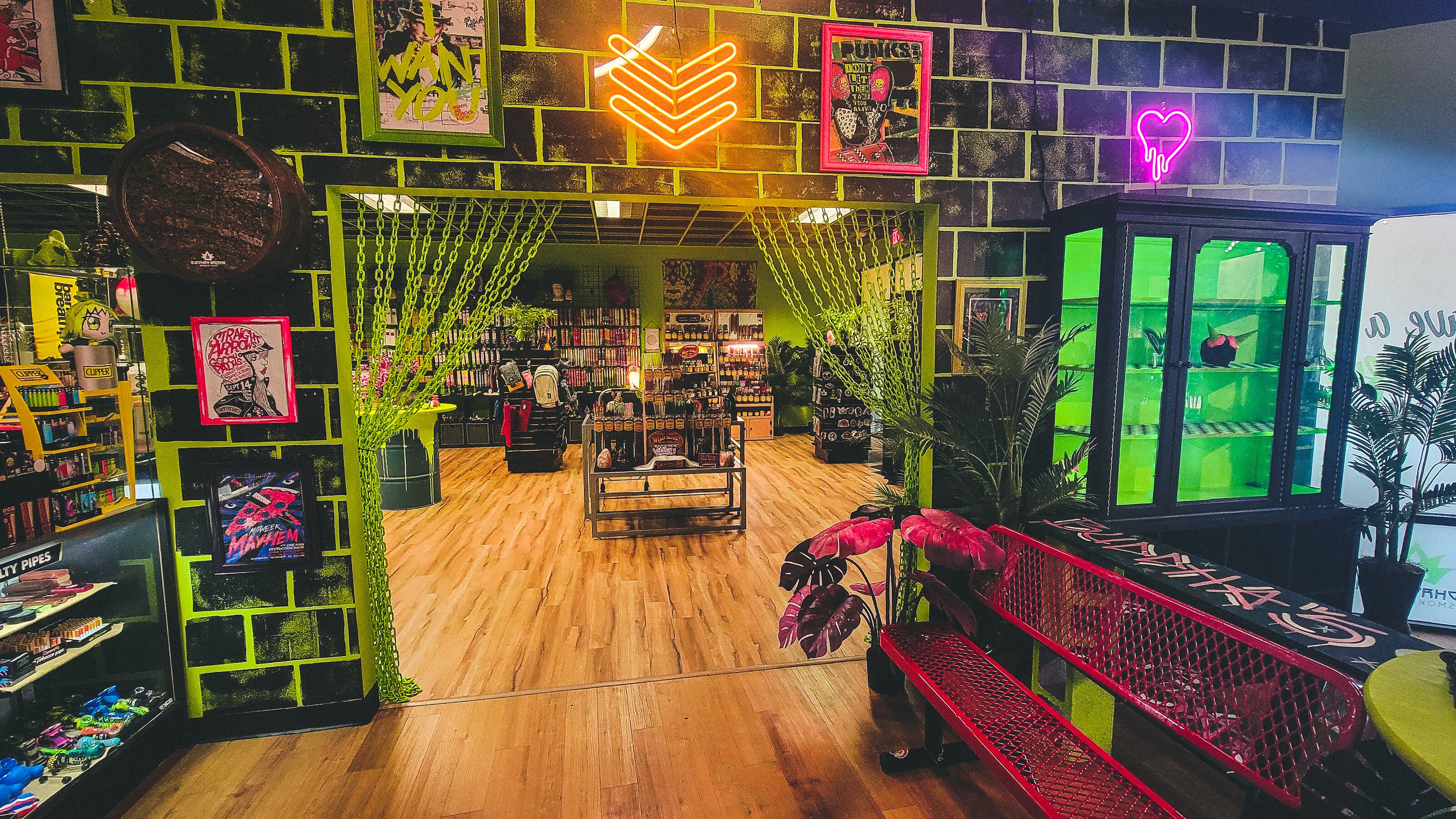
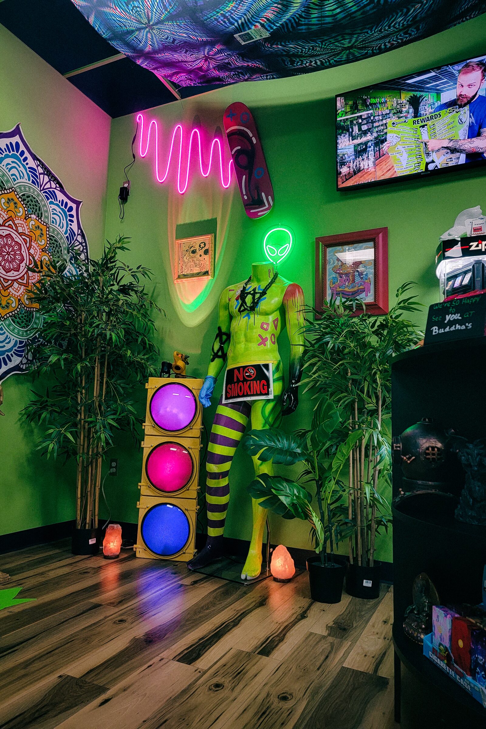
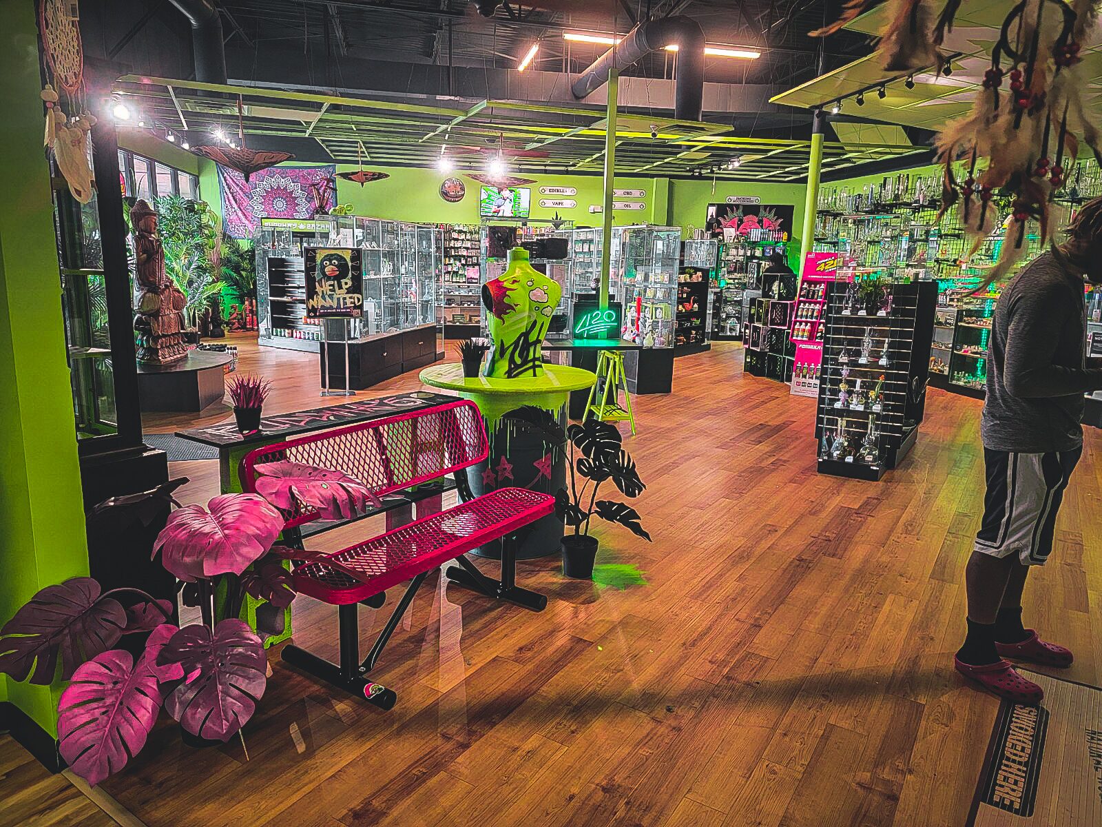
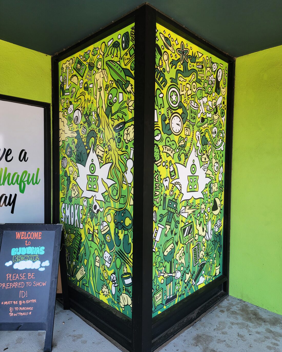
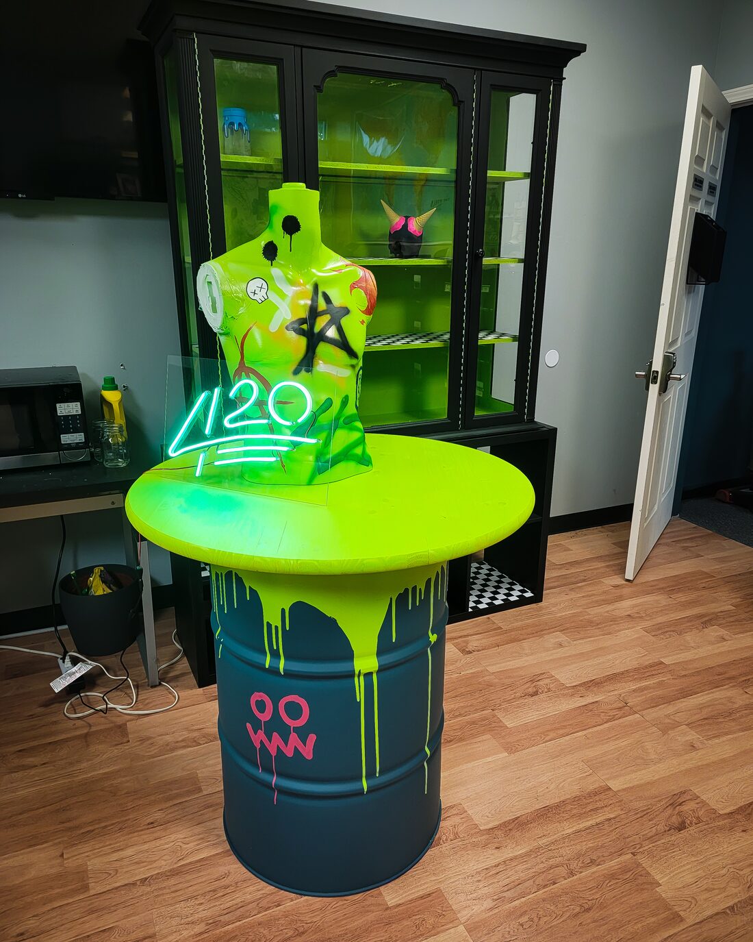
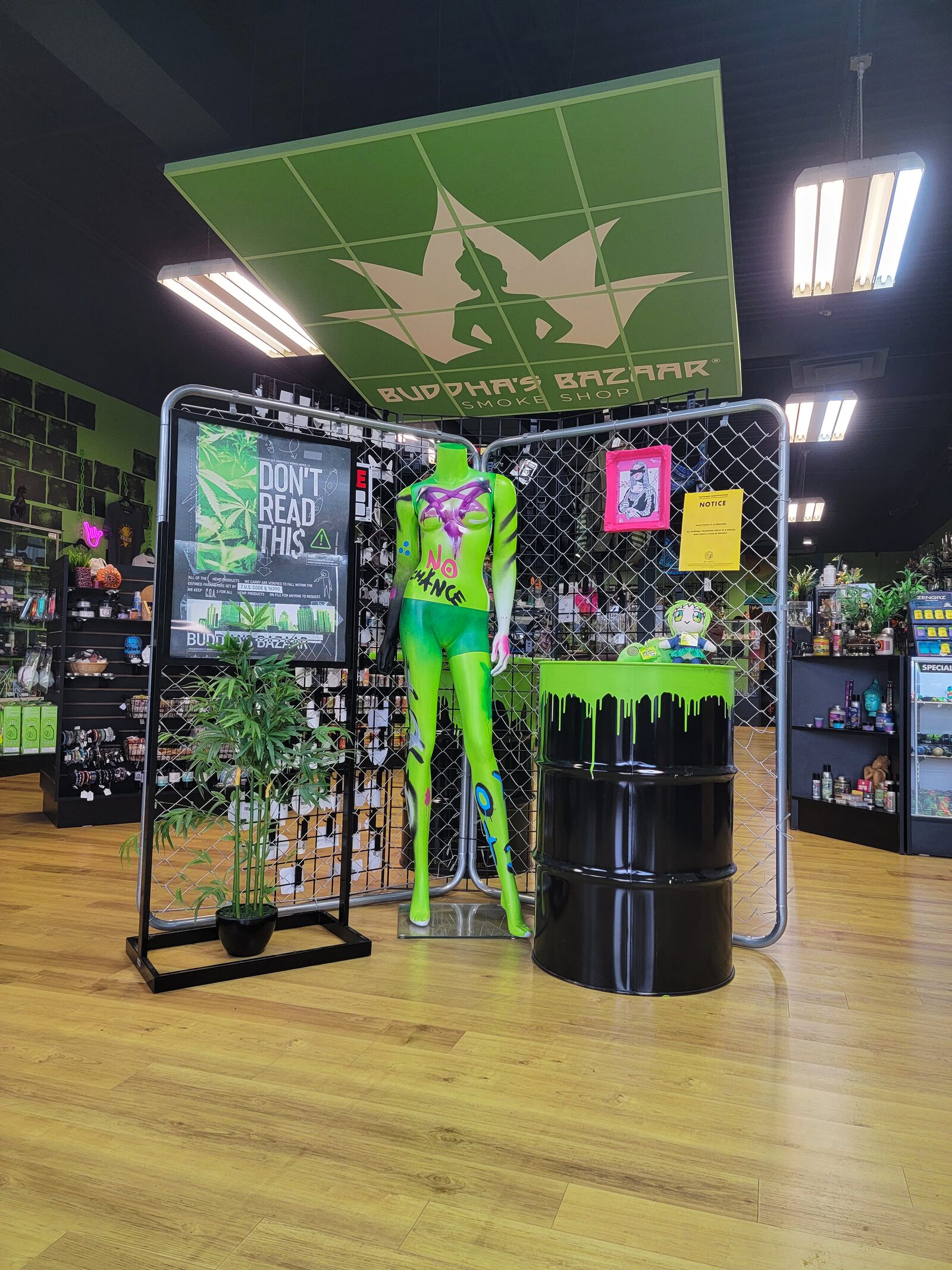
The restyled stores: neon, painted brick, and park-bench seating
Identity
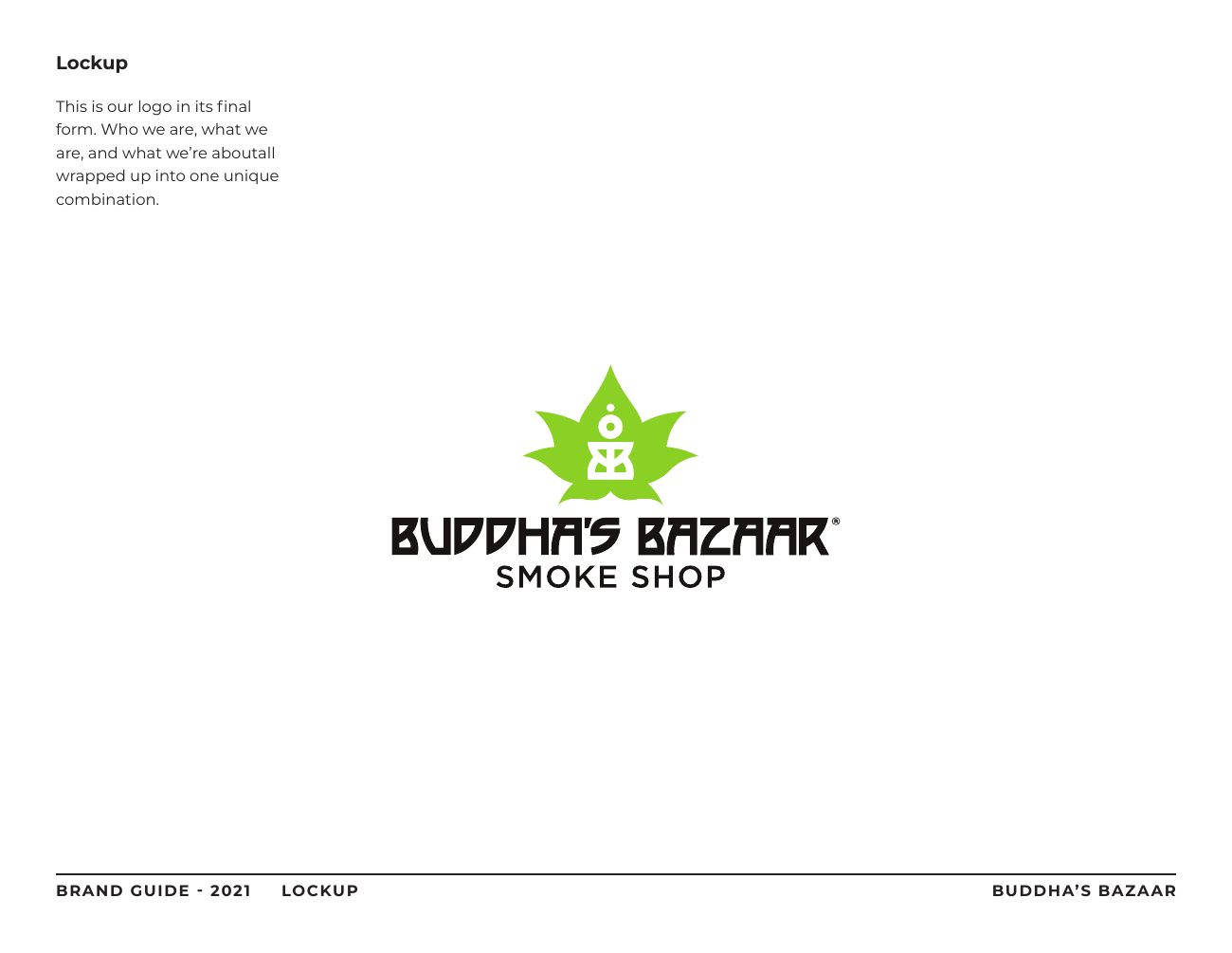
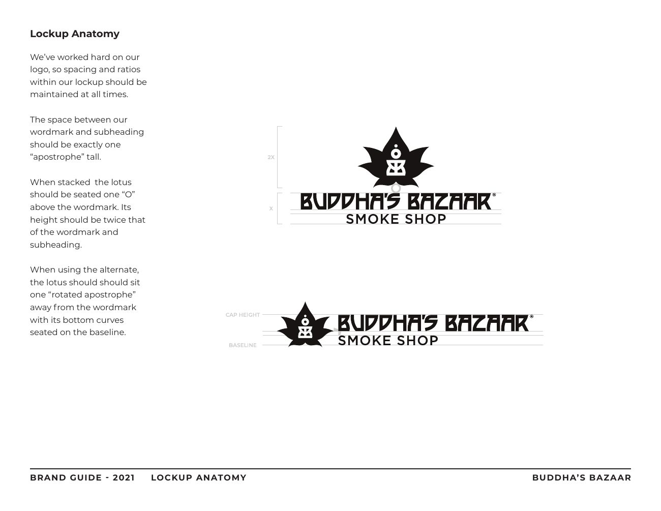
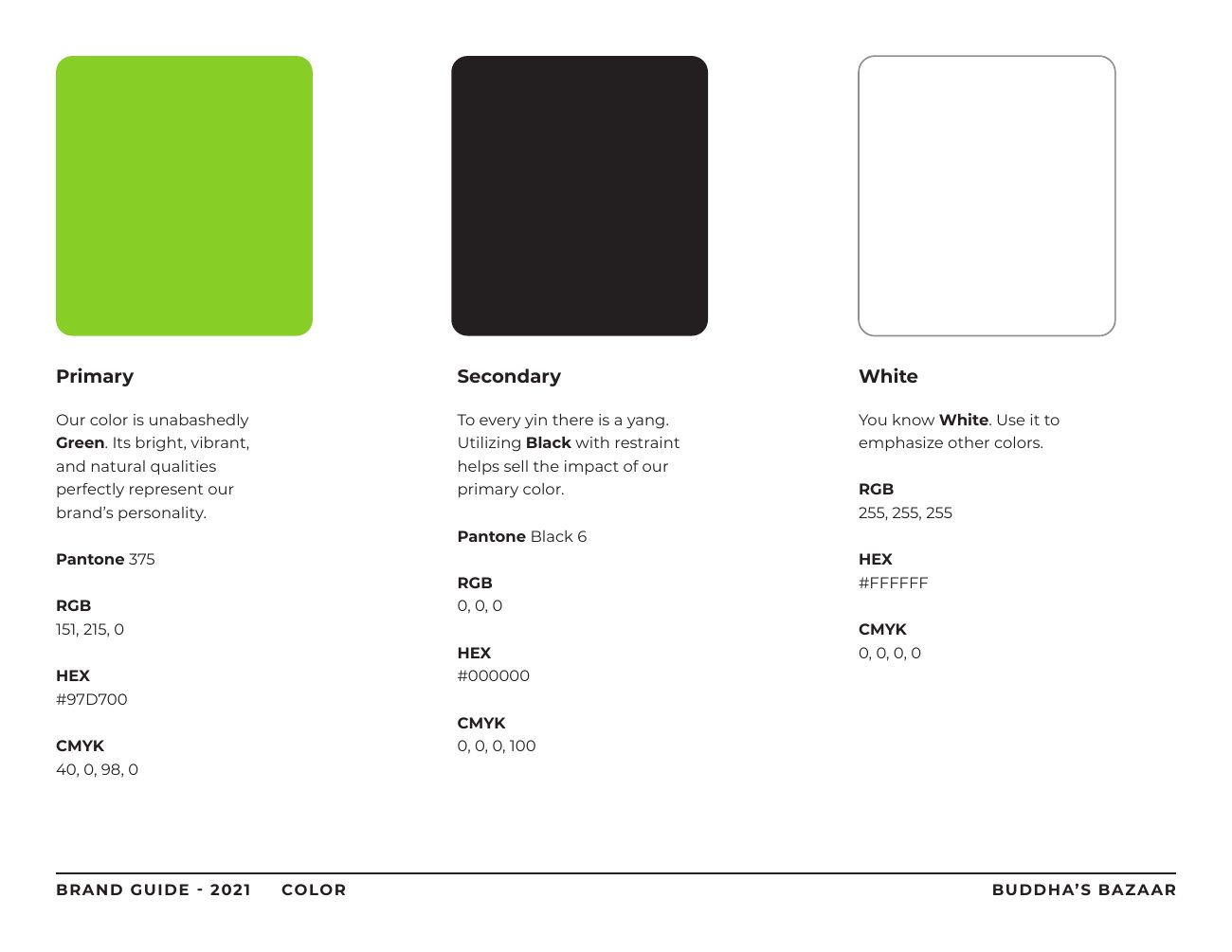
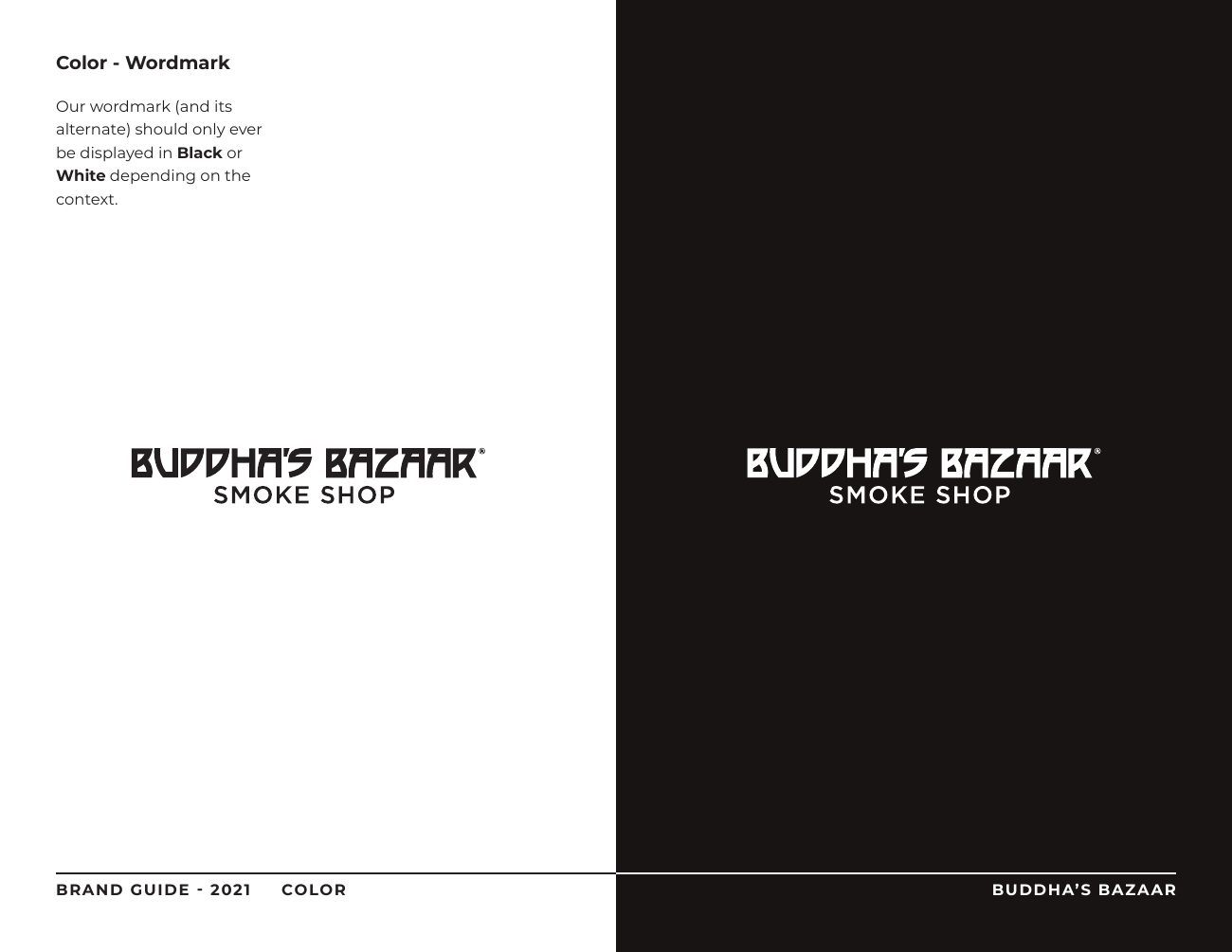
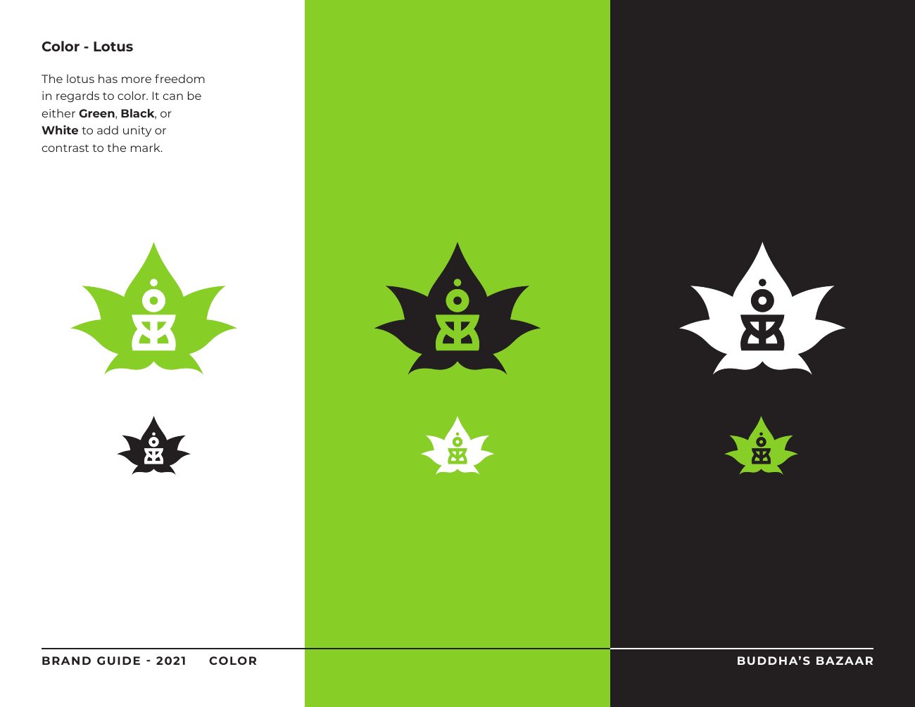
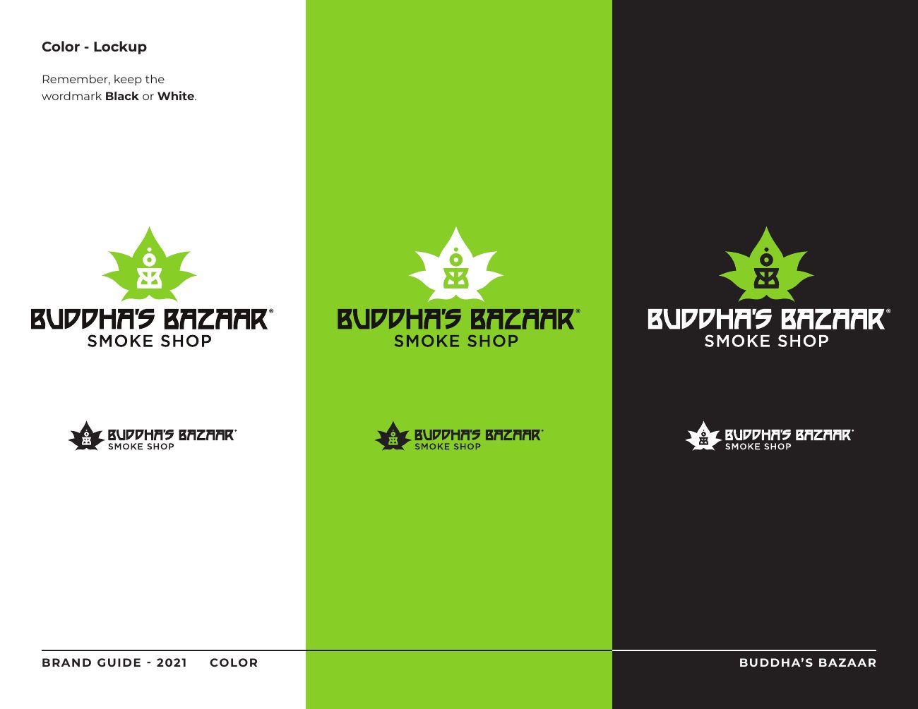
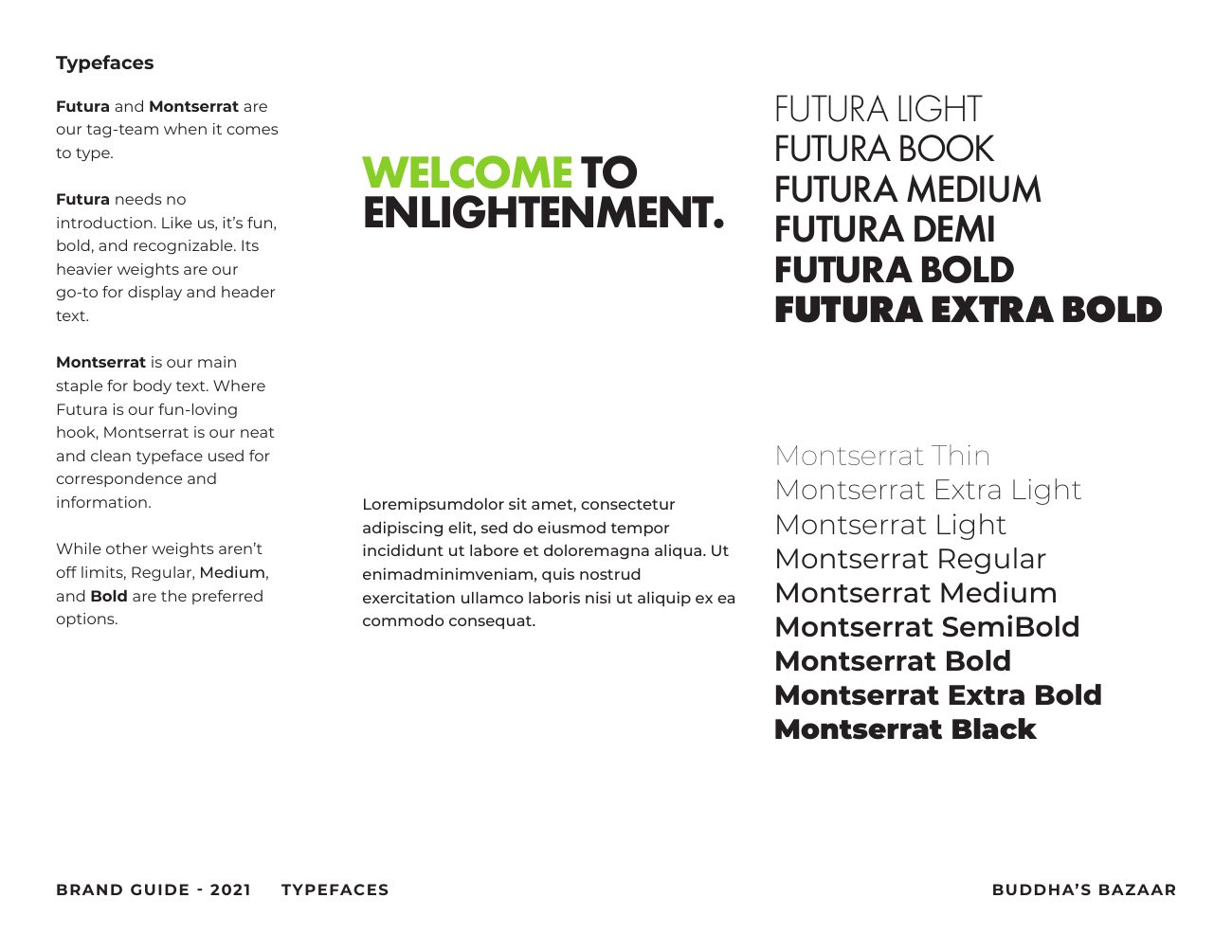
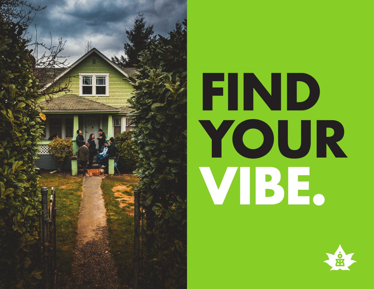
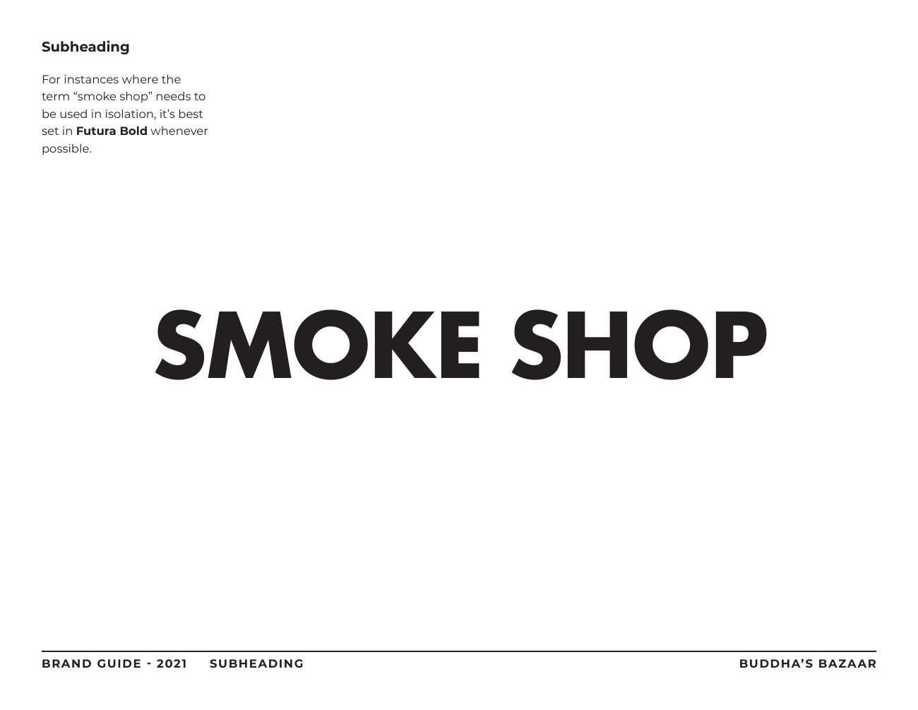
The name was already on the drawing board when I started, but the branding was all mine. The mark is a meditating figure made from two mirrored "B" forms, set inside a lotus that also reads as a hemp leaf thanks to the strong green. That original lockup ran for about six years. I'd made it less than a year out of college, so when the time came, I went back and tightened it up. This time I wrote a full brand guidelines document to go with it.

The restyle
For years the stores were styled holistic and hippy: muted greens, bamboo, natural textures. But the more we learned about who was actually walking in, the clearer it got that our customers leaned streetwear and urban culture, no matter how we dressed ourselves up. So I pitched a restyle across everything: the stores, social, and the web.
In the stores, that meant neon and LED lighting, vibrant greens with hot pink and high-contrast pops, and graffiti sprayed across the furnishings. I hung green chains as door curtains, brought in park benches for seating, and turned thrifted china cabinets into display cases with checkered shelving, neon green paint, and lighting. Old picture frames got spray-painted and filled with sassy artwork. I even mapped the brandmark across a 10x10 grid of printed ceiling tiles, which picked up a PICA Award.
Social and email
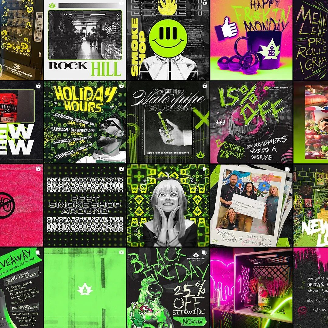
I took over most of the social media and moved it away from strictly sales and events toward memes, jokes, and generally funny stuff. Engagement went up noticeably. On email, we held an open rate around 50%, which isn't bad for a local shop. I wrote the website copy too.
I also created Toki, an anime-style mascot meant to draw in a new crowd. She opened up a run of promos, including a local cosplayer appearing as her at one of the stores.
Products
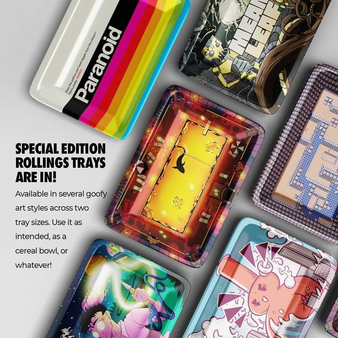
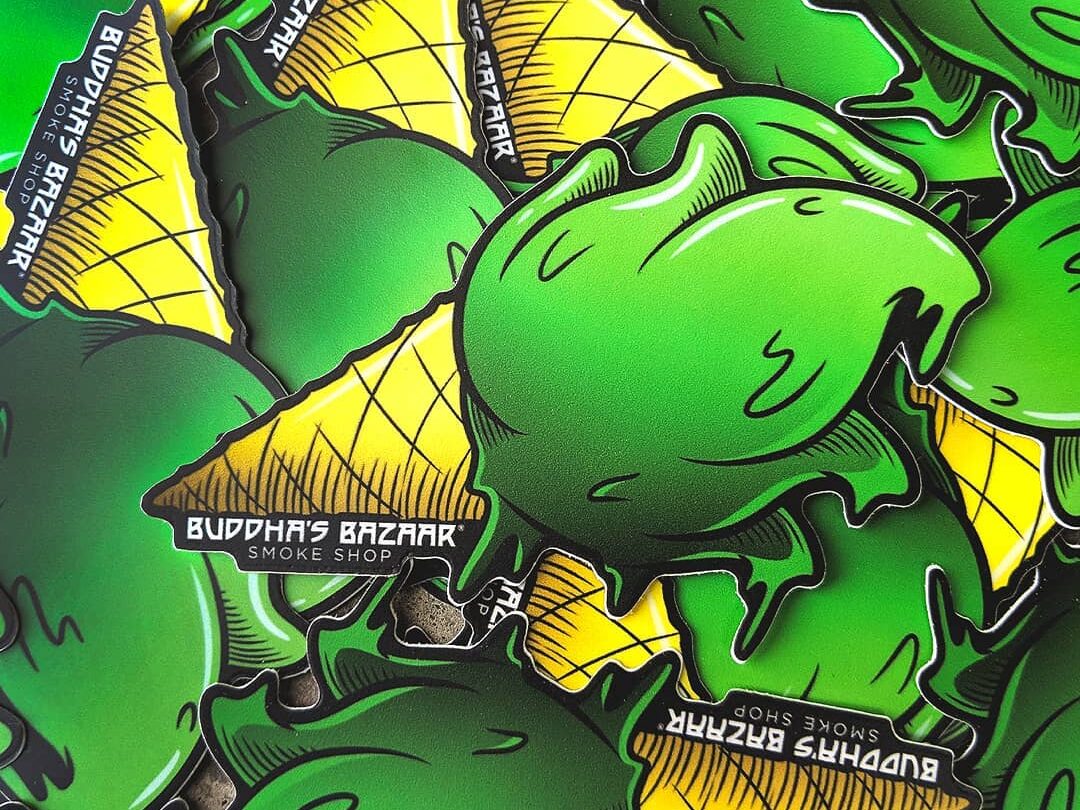
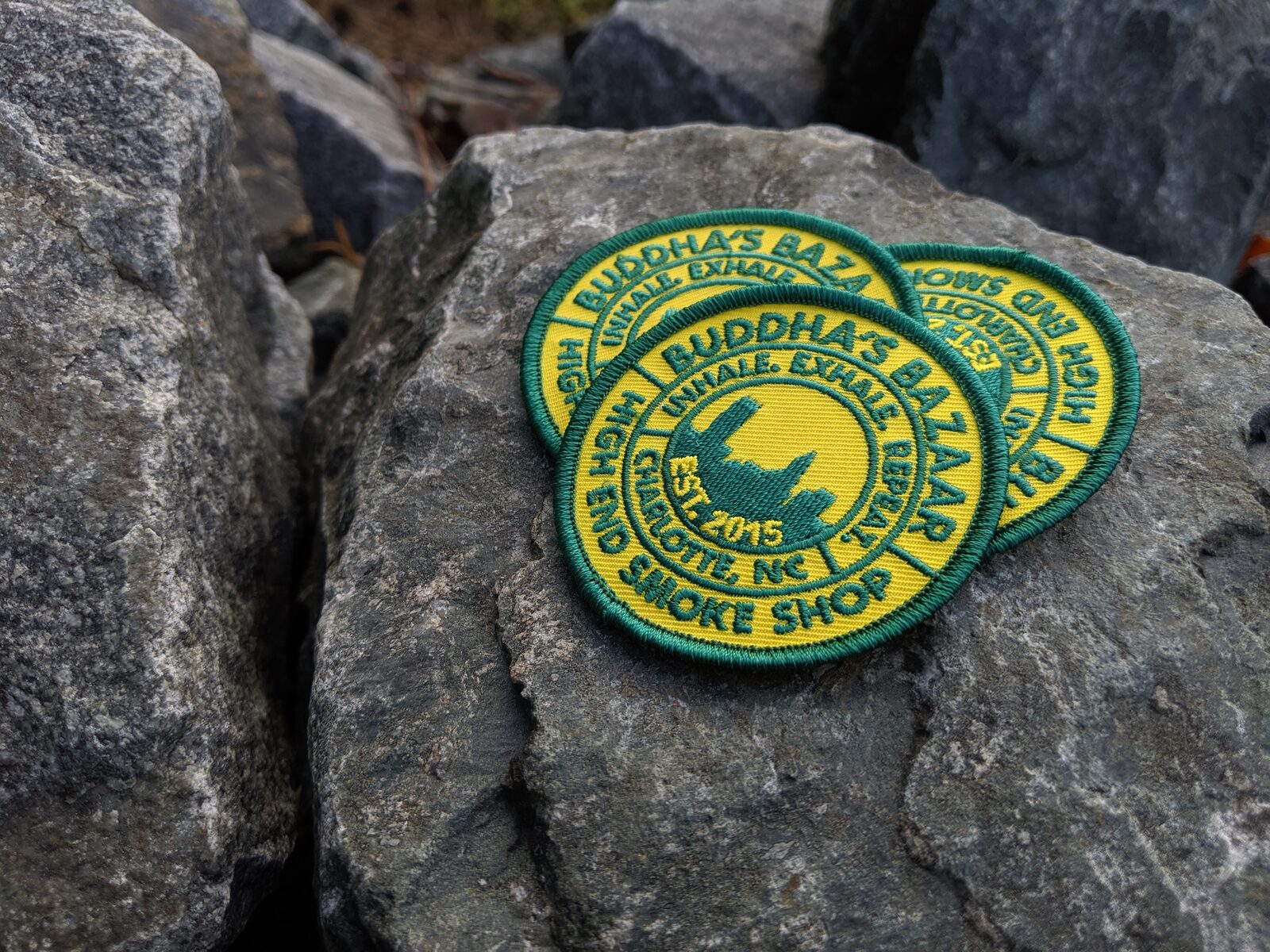
The stores sold their own merch too: illustrated rolling trays, T-shirts, grinders, lighters, and other swag. Some in-house products grew into brands of their own, like Luma and Mean Leaf.
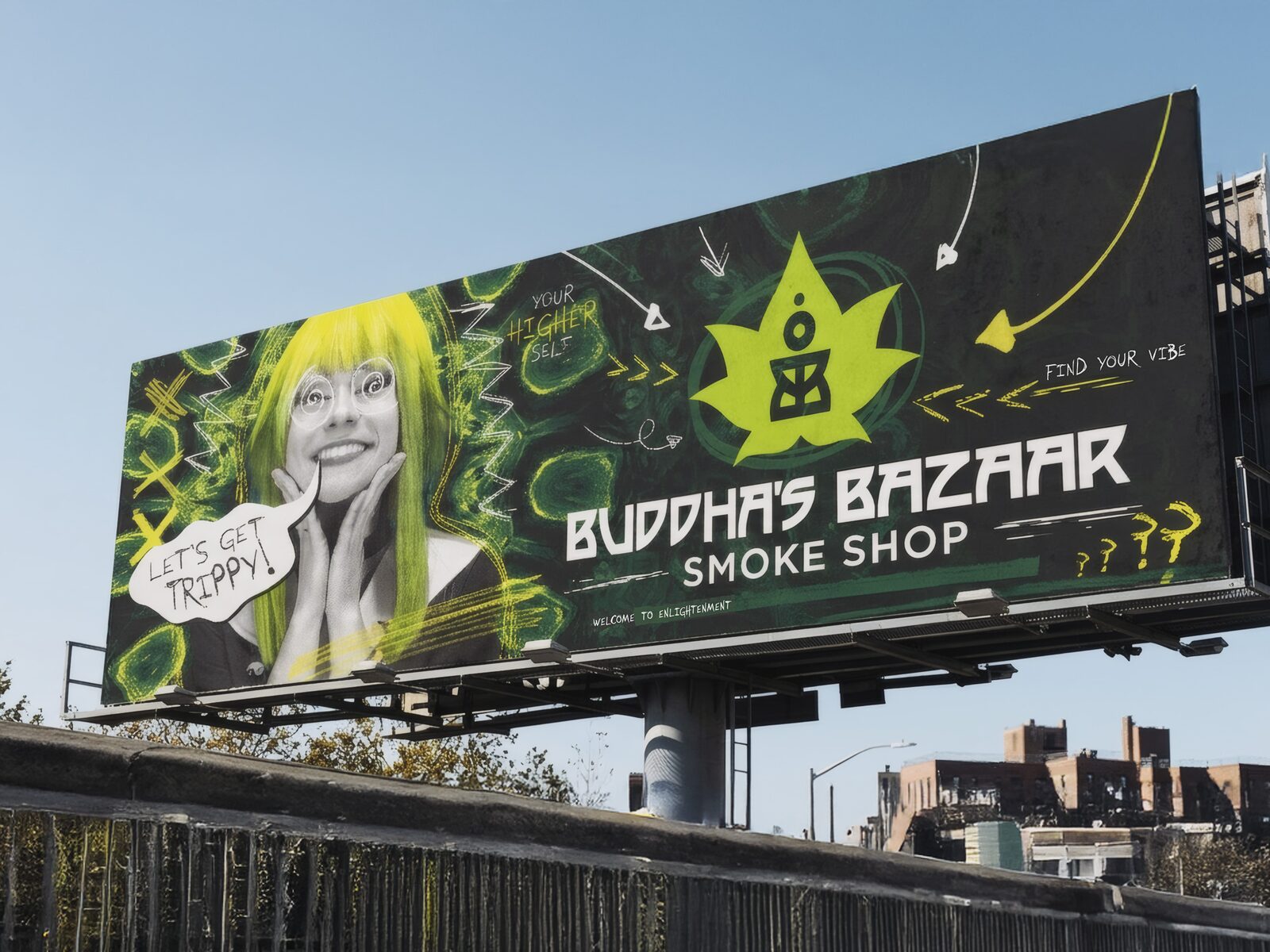
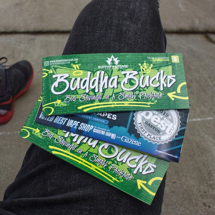
Print covered just about everything: brochures, mailers, posters, yard signs, banners, event displays, and in-store signage. The vehicle wraps and billboards were the fun ones.
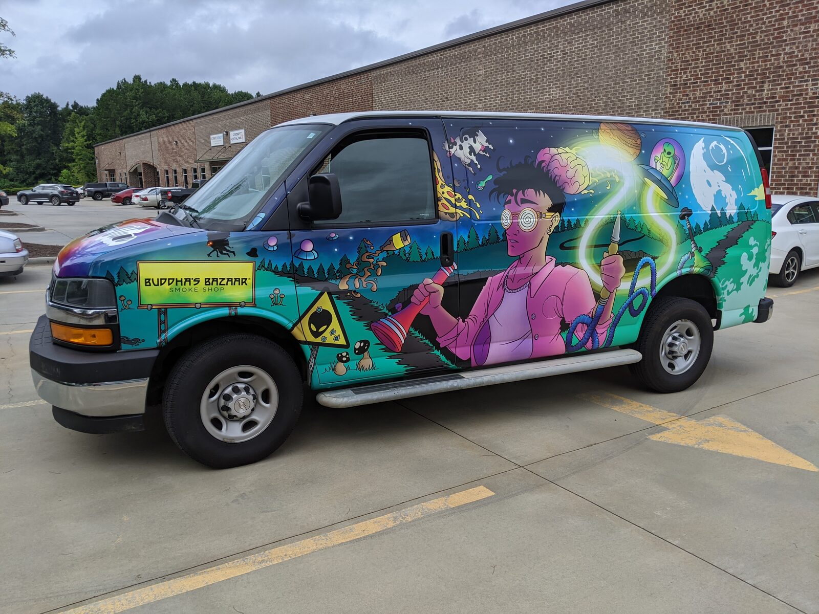
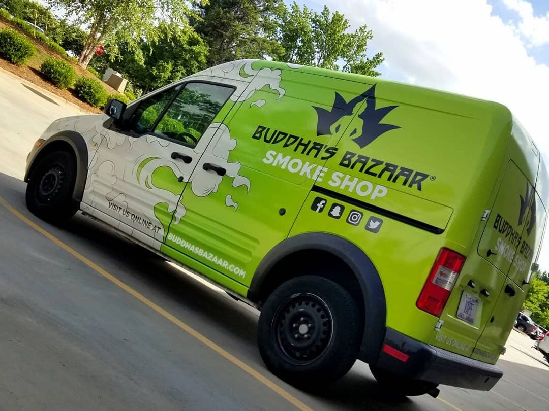
Most company vans advertise with a wall of text, so for the illustrated van I went the other way. It's a full wraparound mural of a trippy, spiritual, out-of-this-world scene, meant to sell the store without saying a word. The green van harkens back to the flames on the front of an old-school hot rod, only with smoke in place of fire, over our branded green.
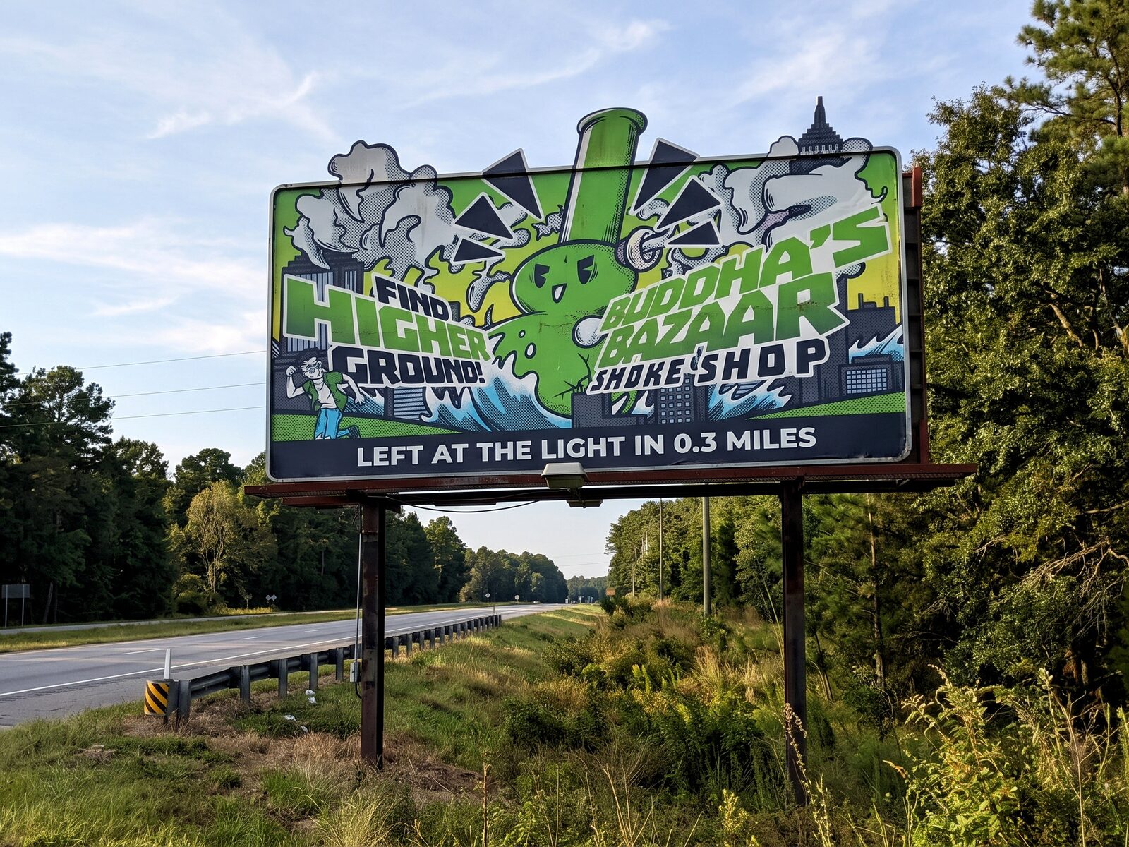
Find Higher Ground was another fun one: a Godzilla-sized waterpipe stomping through a city, which sets up the double entendre.