Atom Power
Atom Power was an eight-year-old company that still carried the visual disorder of a first-year startup. As the sole designer for the entire company, I was brought in to bring cohesion to a brand that looked hasty and disorganized, and to support a marketing team that needed a reliable creative engine. The work spanned everything from technical documentation to the company website, all of it lacking a unified standard.
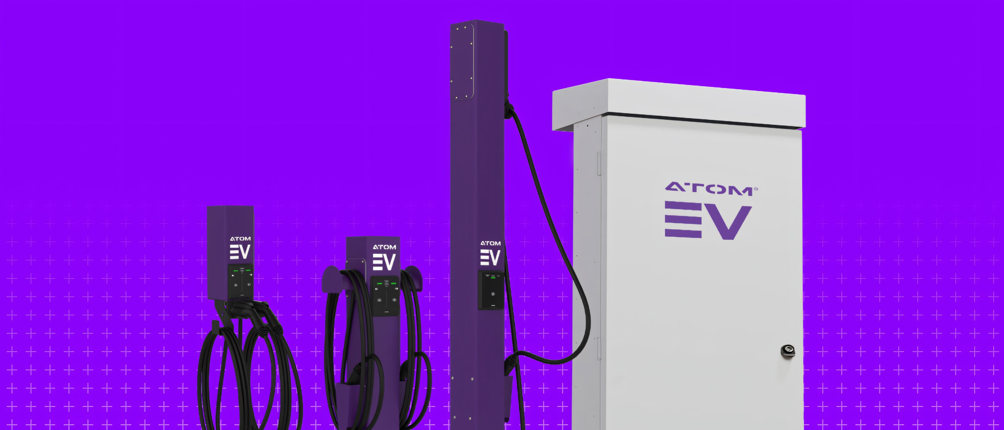
The E100 Level 2 product family


Technical documentation
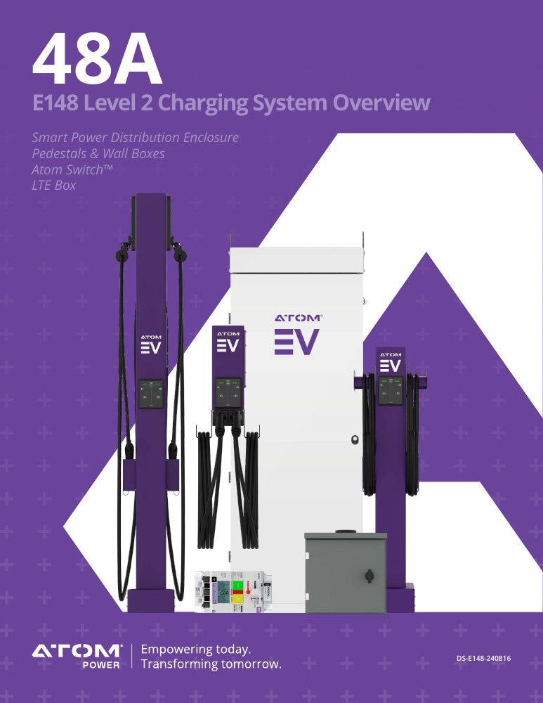
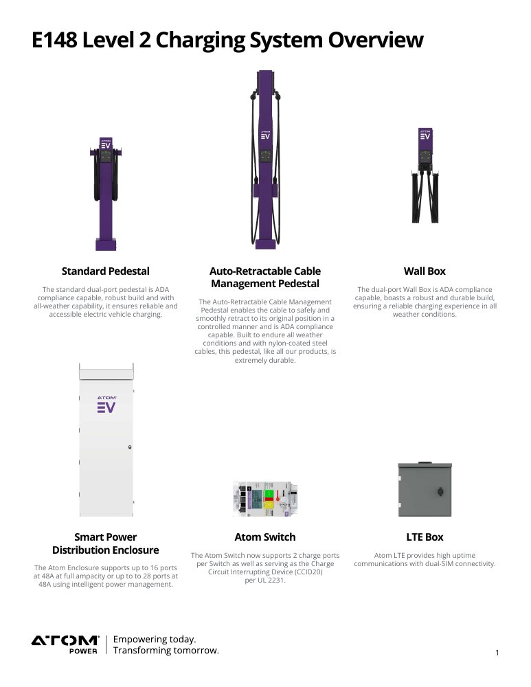
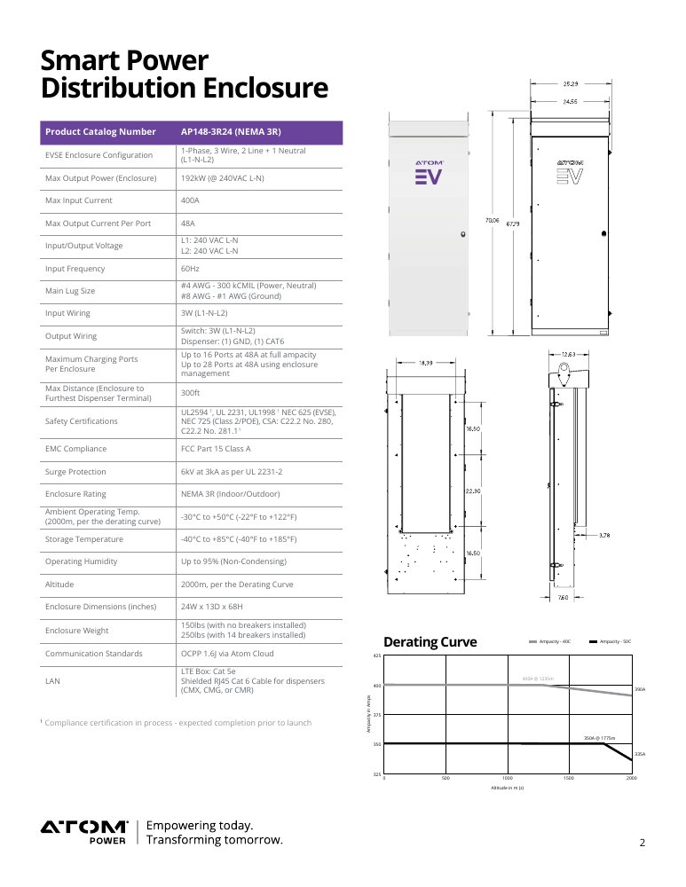
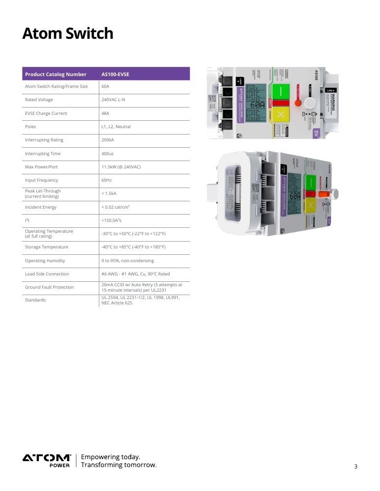
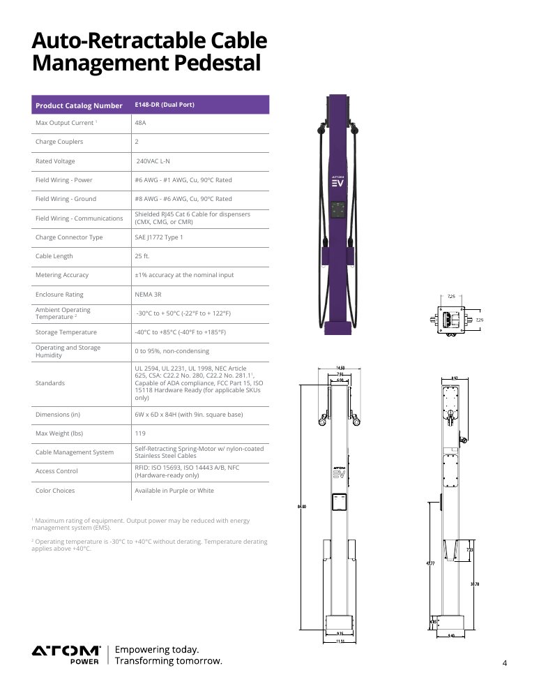
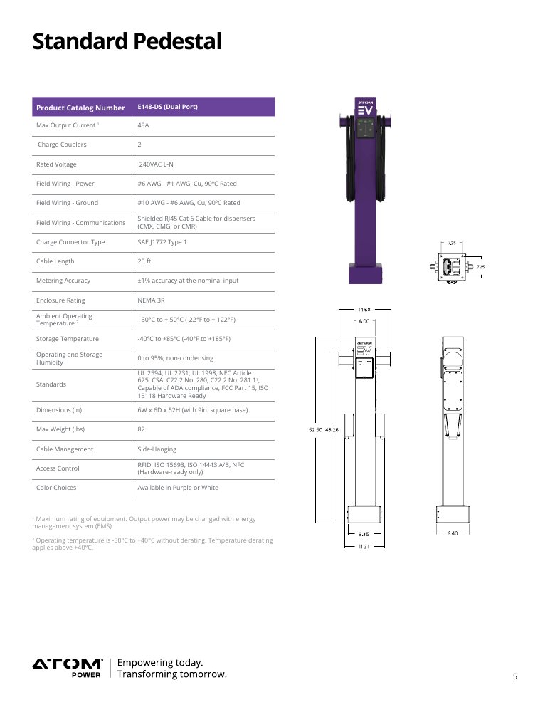
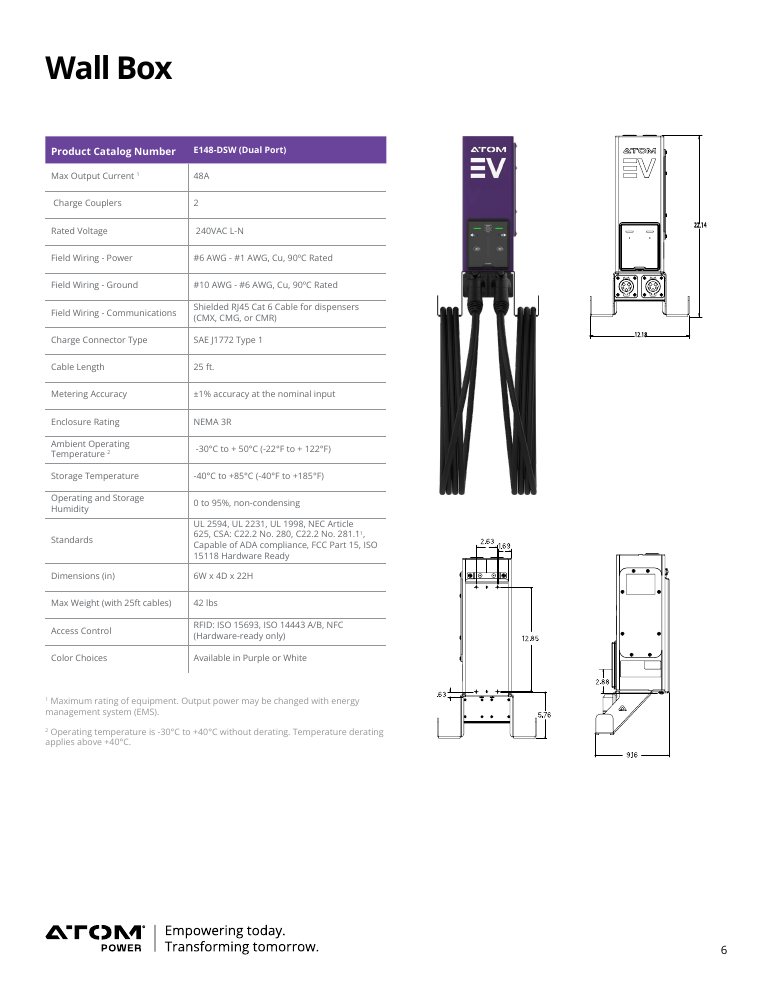
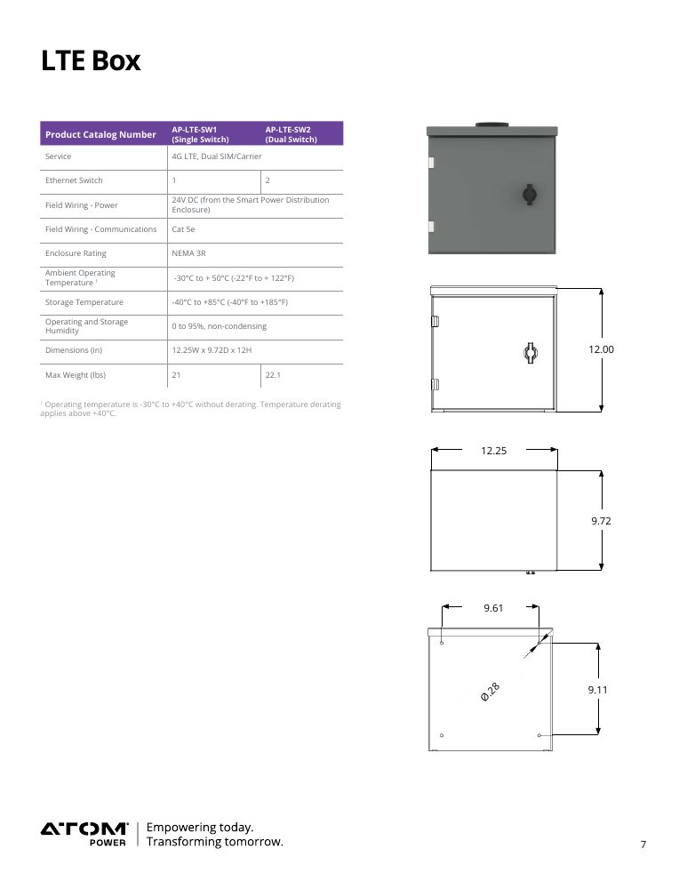
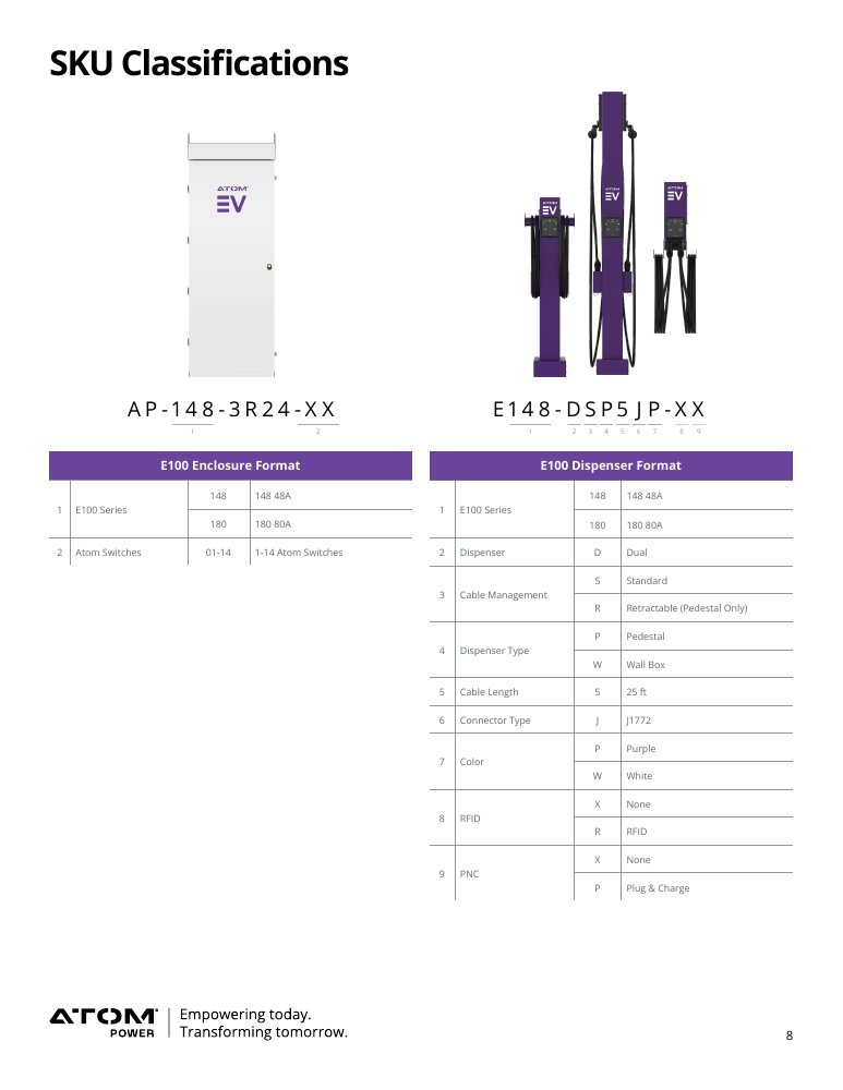
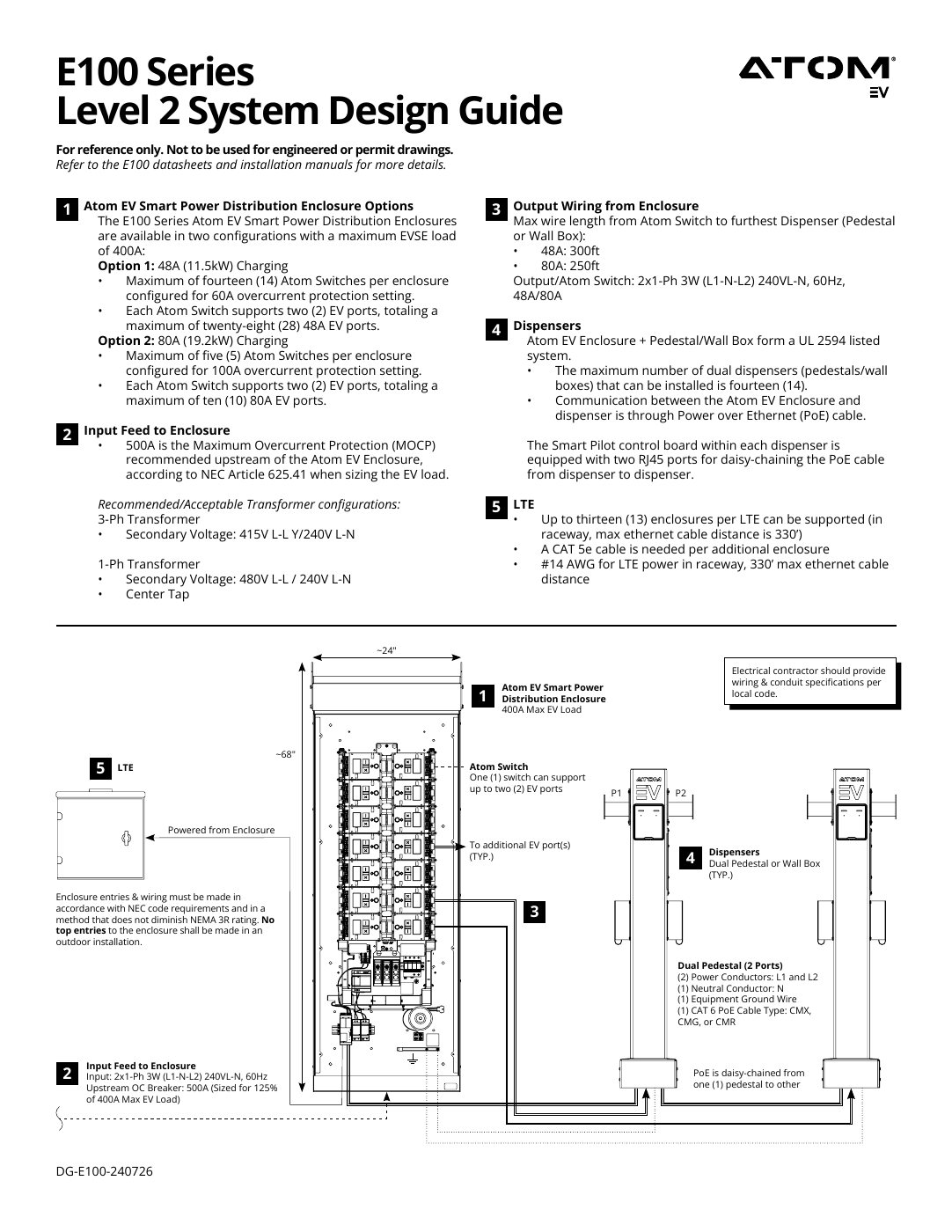
The bulk of my work lived in the details that mattered most: technical sales collateral for the company's EV hardware. Installation manuals, data sheets, and product documentation: lengthy, diagram-heavy booklets governed by strict electrical-industry regulations around symbols, disclaimers, and safety standards. In a field where an unclear instruction can be dangerous, precision wasn't optional. I maintained and continually refined this documentation as products and specs evolved, keeping a large, complex library accurate and on-brand through constant change.
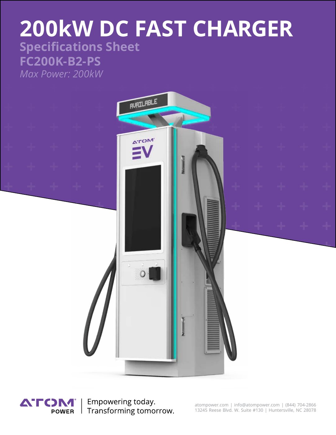
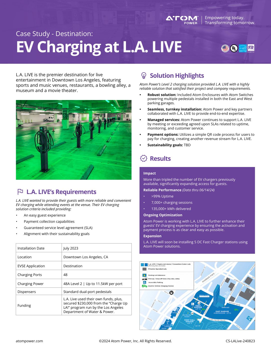
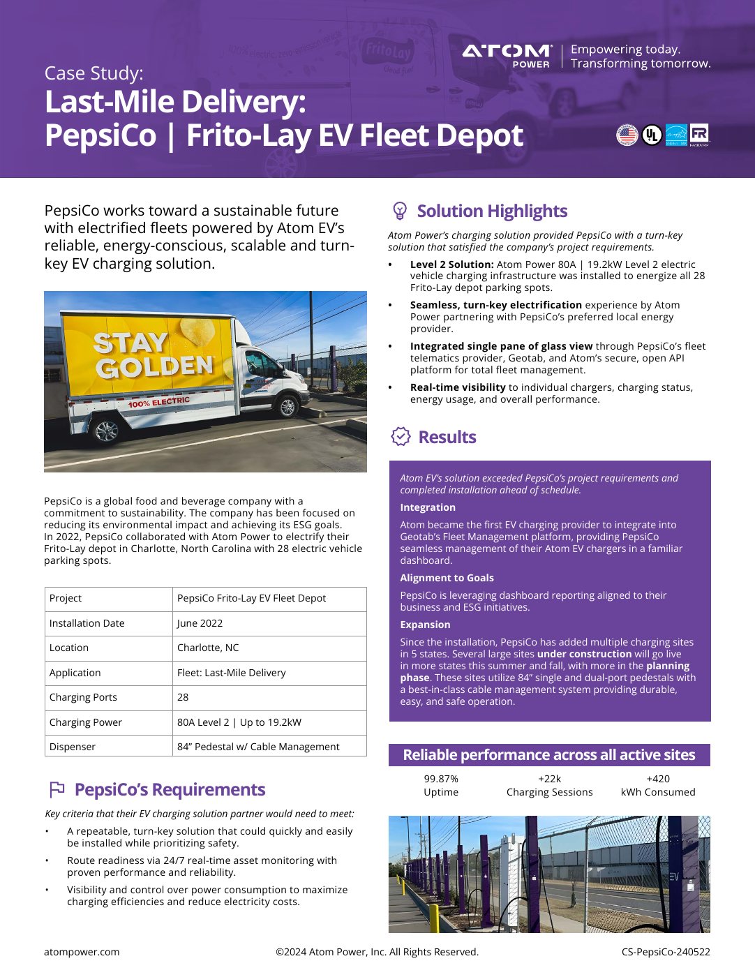
Brand and collateral
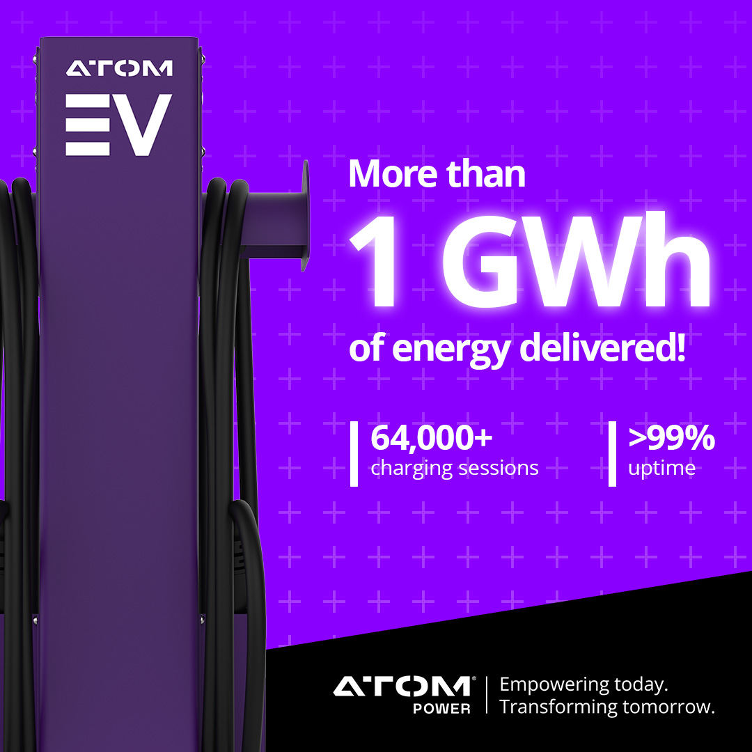
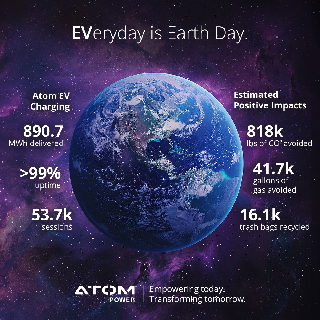
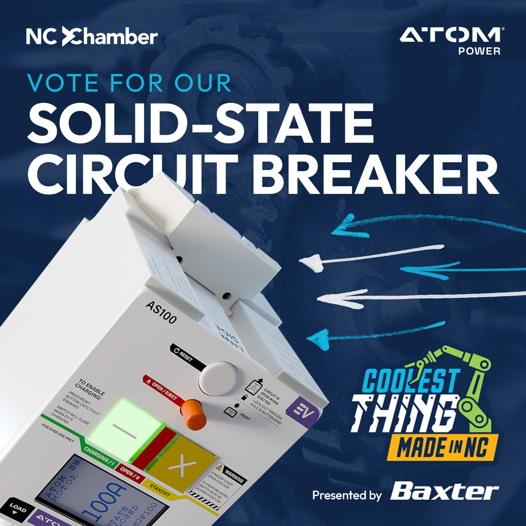
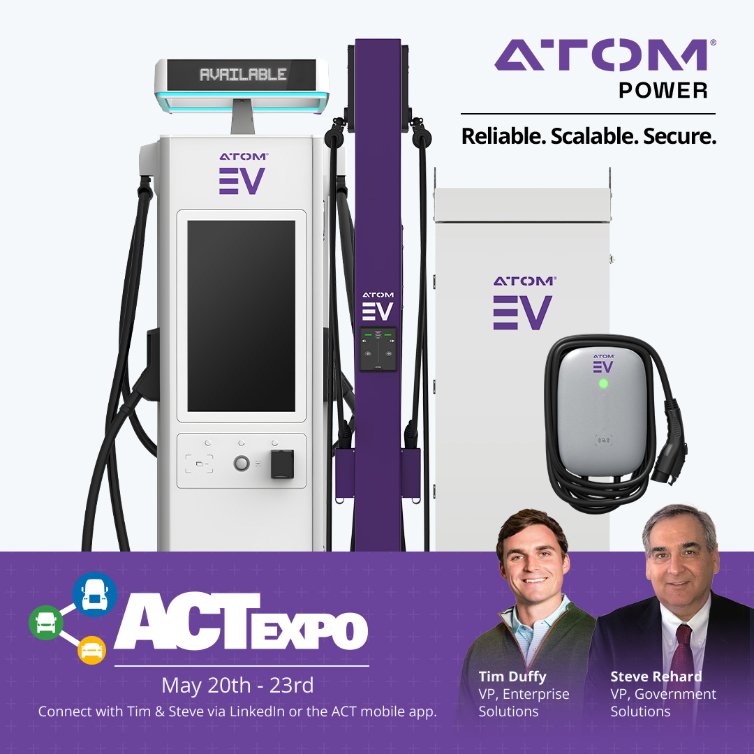
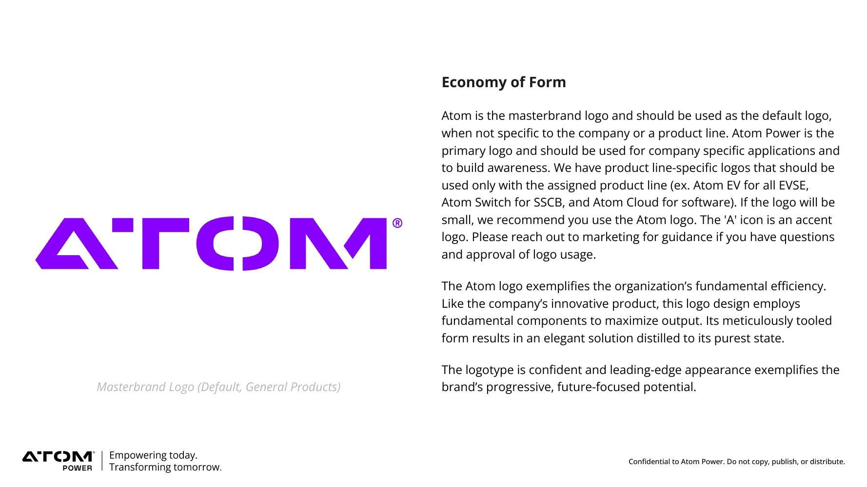
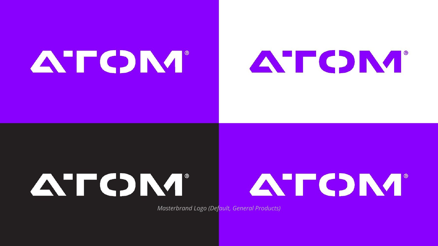
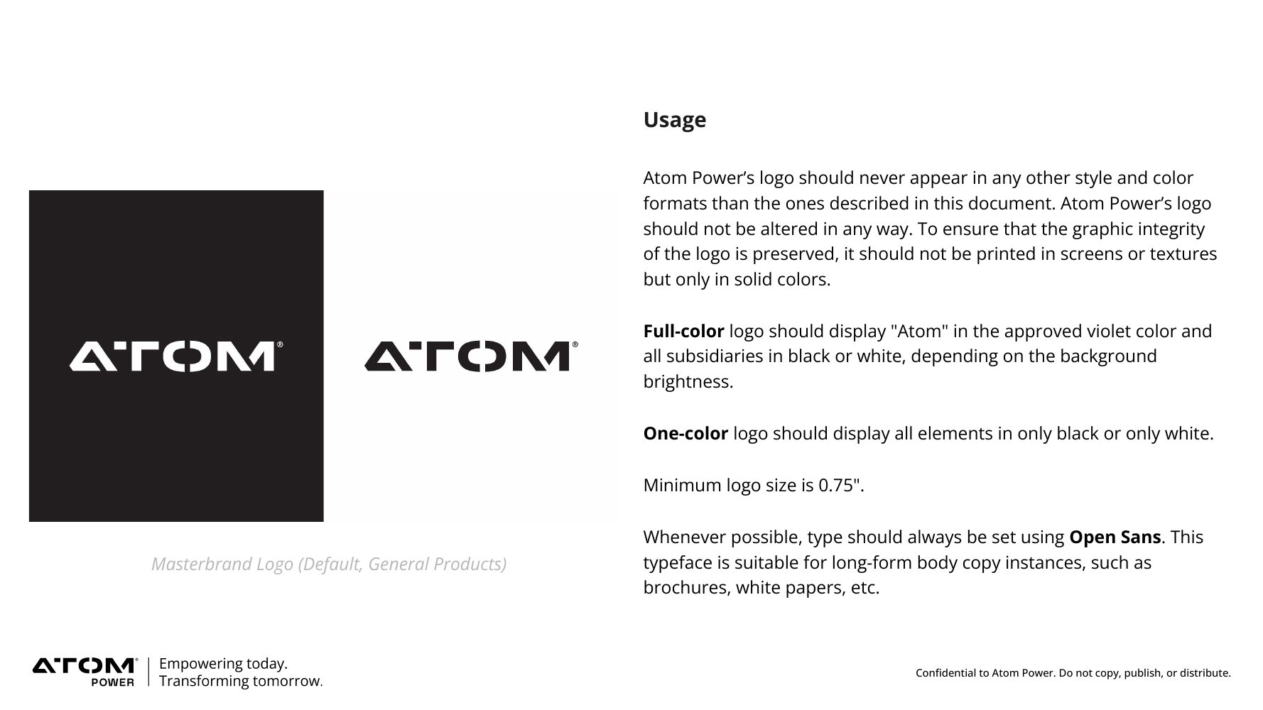
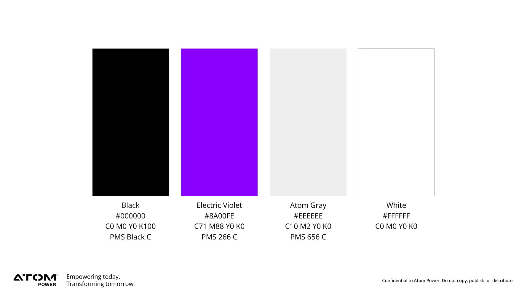
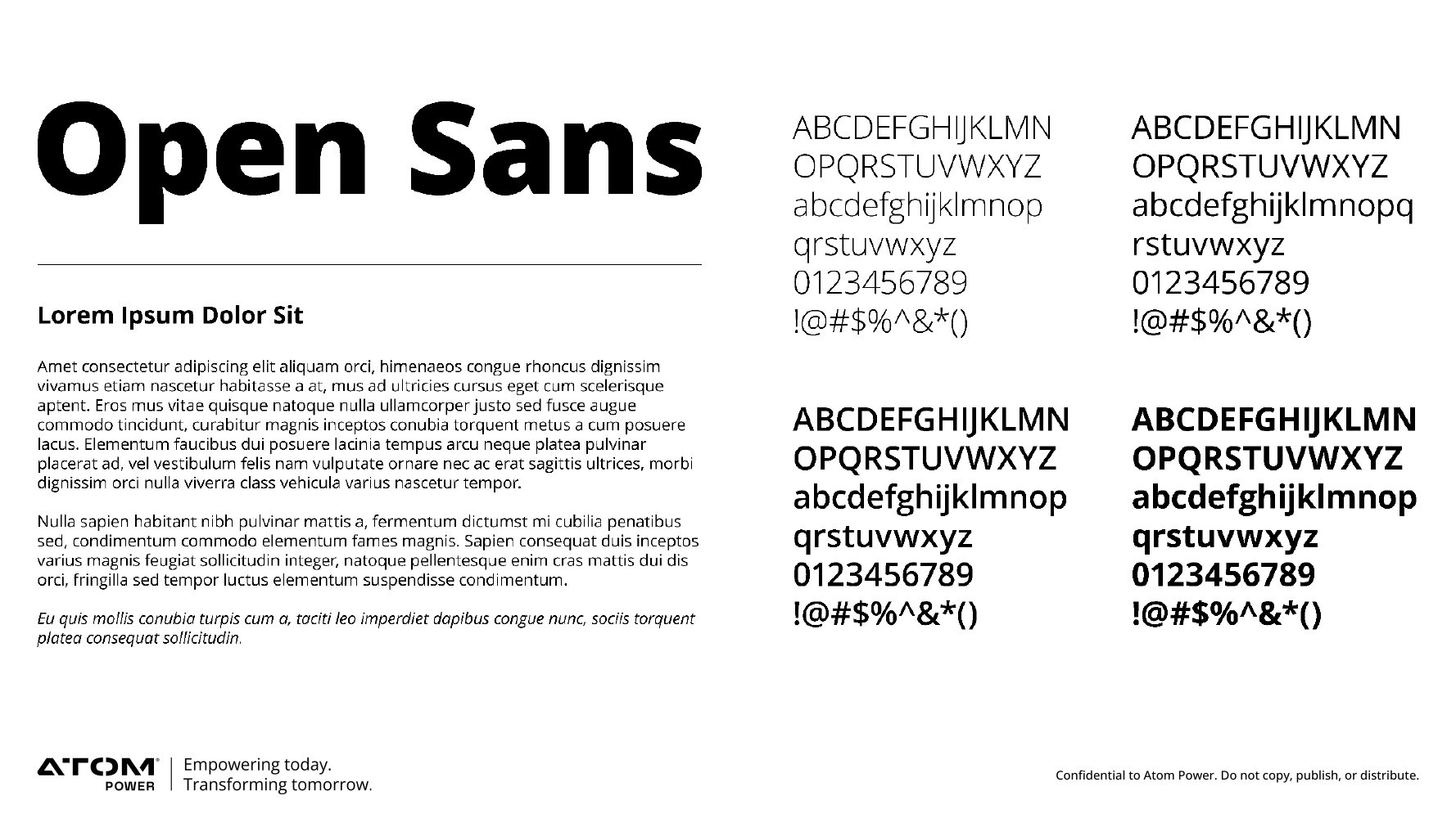
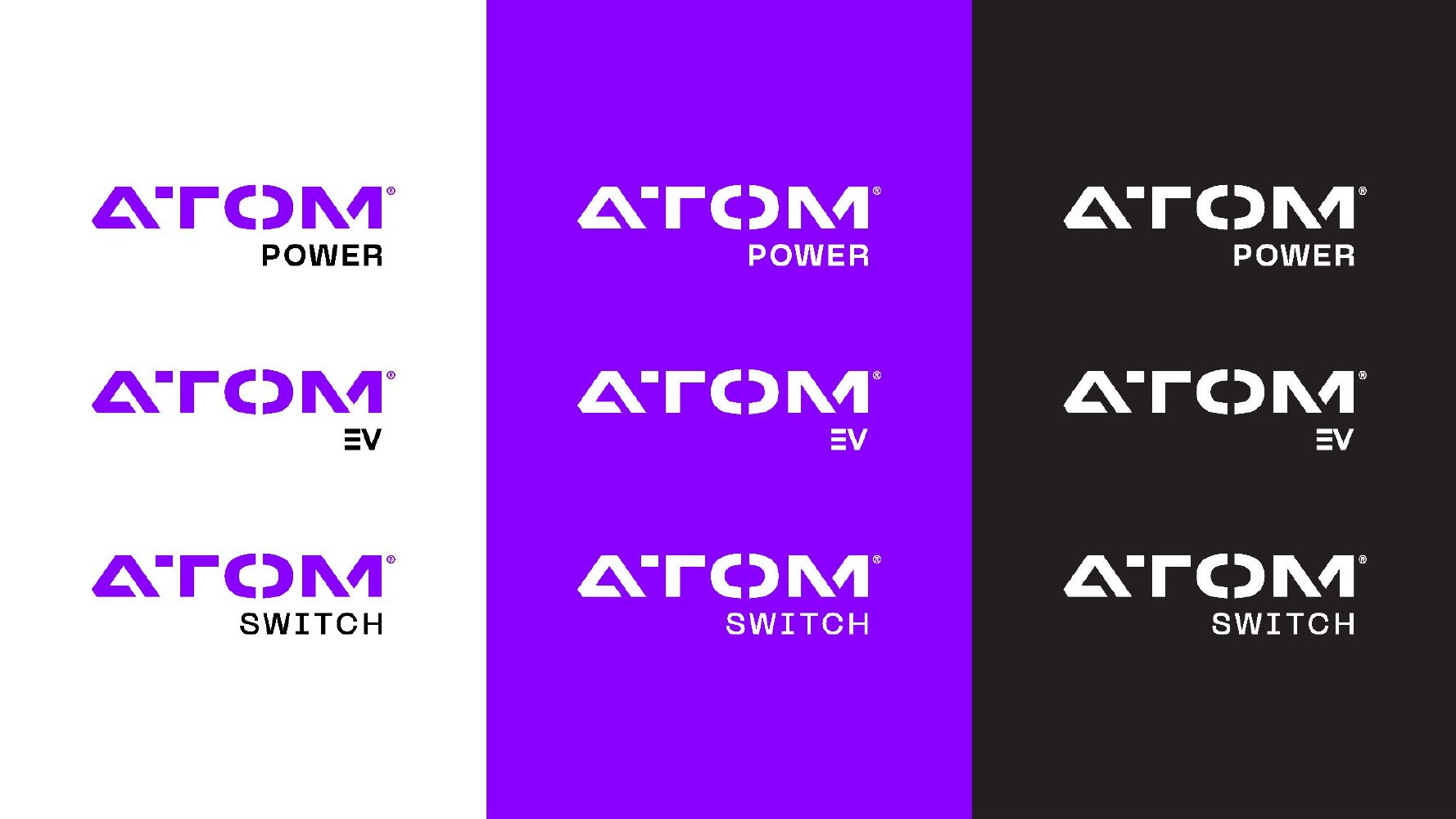
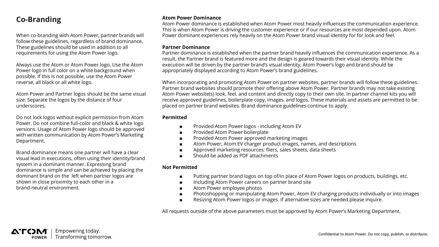
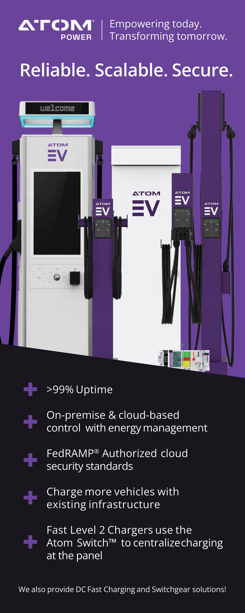
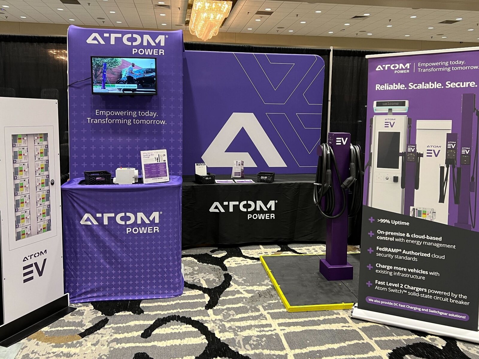
Alongside that, I refined the company's brand guidelines and applied them across every touchpoint: presentation decks, trade show assets, sales materials, and the product itself. The goal throughout was consistency: taking a scattered visual identity and giving it a single, cohesive standard.


Website
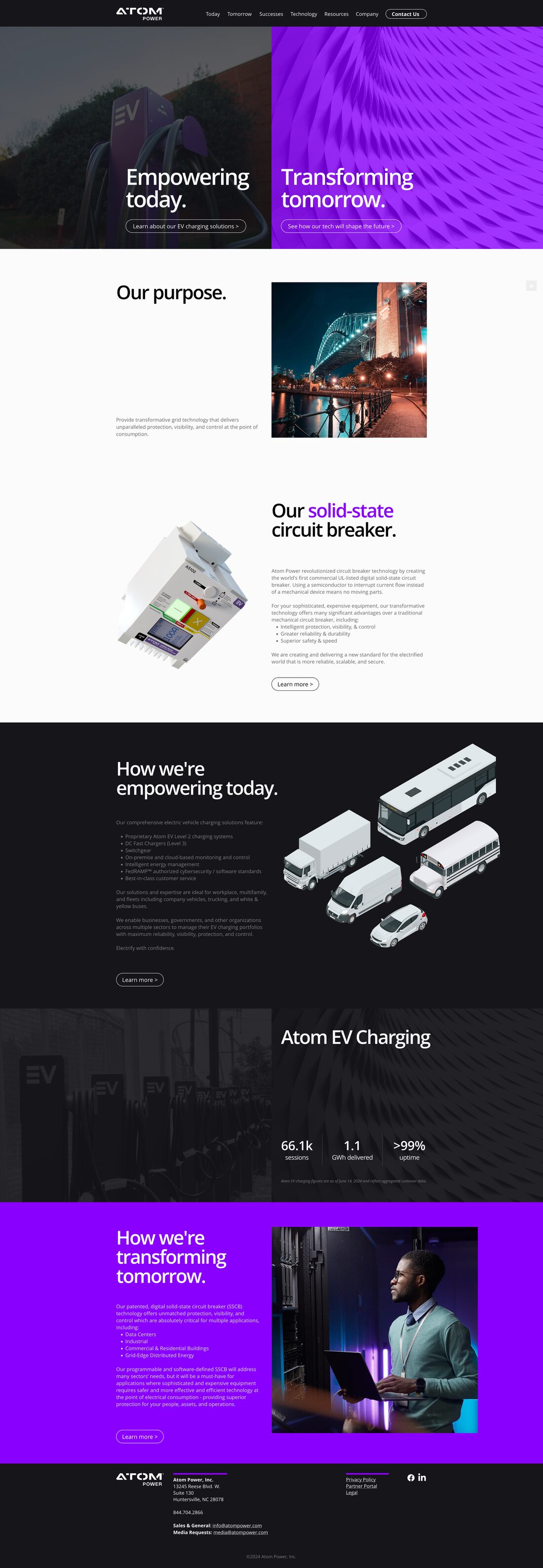
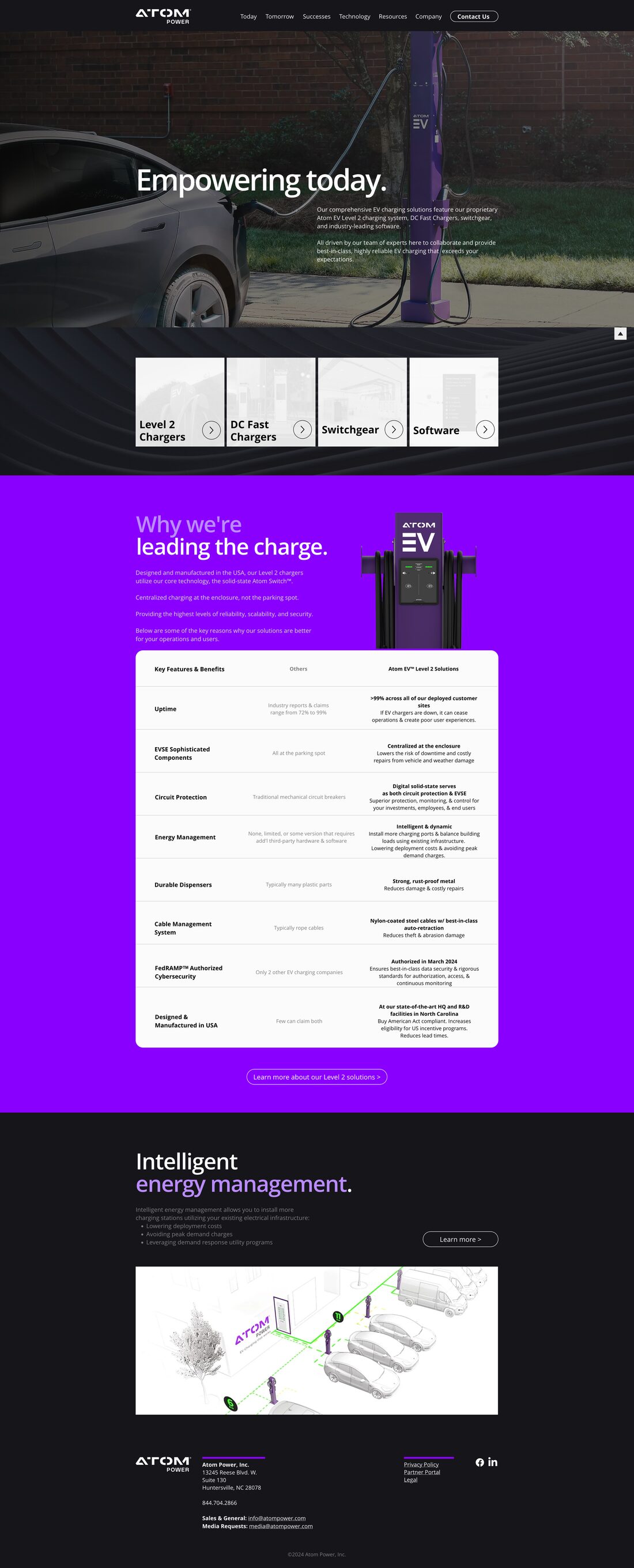
I also led a full redesign of the company website. Working with our marketing team, I mapped the user flow, established the layout, and built a guided experience focused on informing visitors and driving leads, delivered as a seamless swap from the old site. Site analytics trended upward after launch, with retention improving once the structure was simplified.
Social