Komodo Kava House
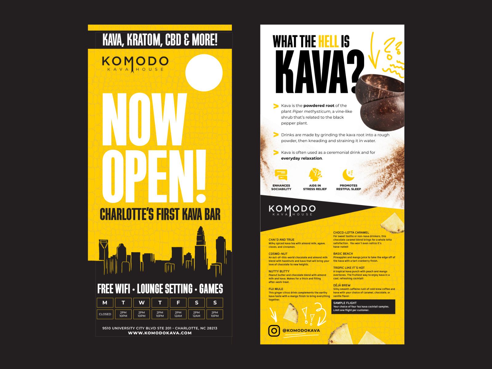
Komodo Kava House was Charlotte's first kava bar. Asheville had them, but Charlotte had never seen one, so the brand had to explain what kava is and make a strong first impression at the same time.
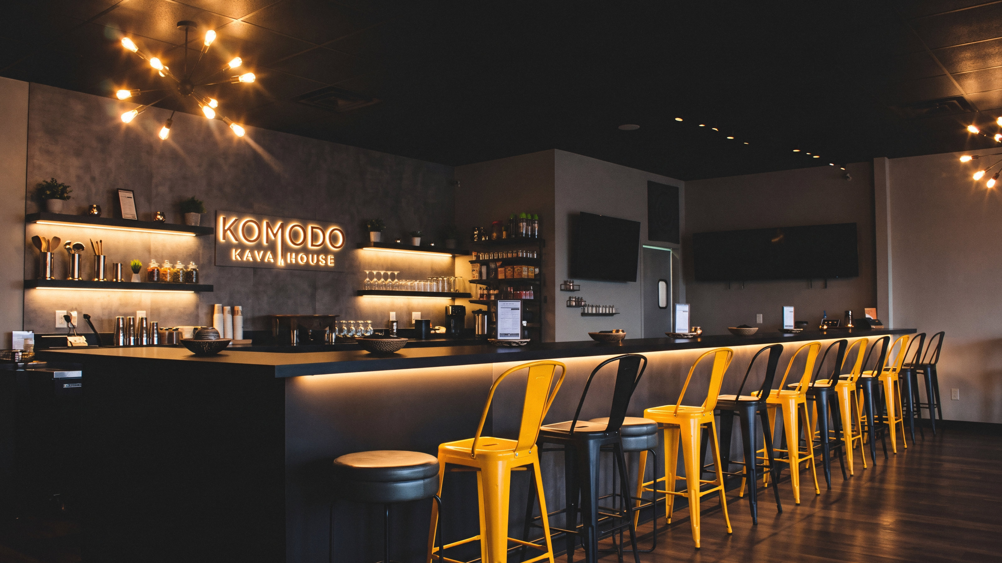
The bar and lounge on University City Blvd
Identity
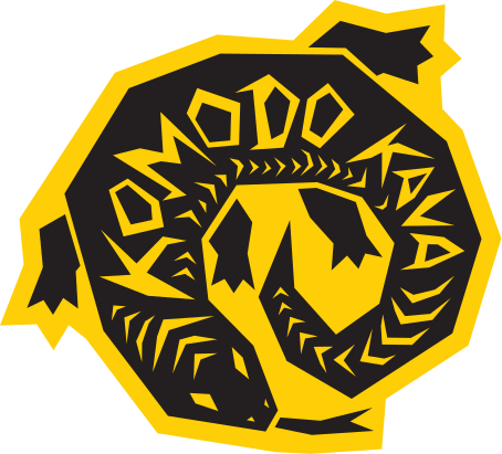
The name was my pitch. Kava comes from the South Pacific, and komodo dragons are native to the same general part of the world, so the lizard became the foundation. The mark has a cheeky forked tongue that splits the subheading, which turned into a motif for a lot of the work that followed. The goal was clean and suave without tipping into luxury: straightforward, with a twist.
Collateral
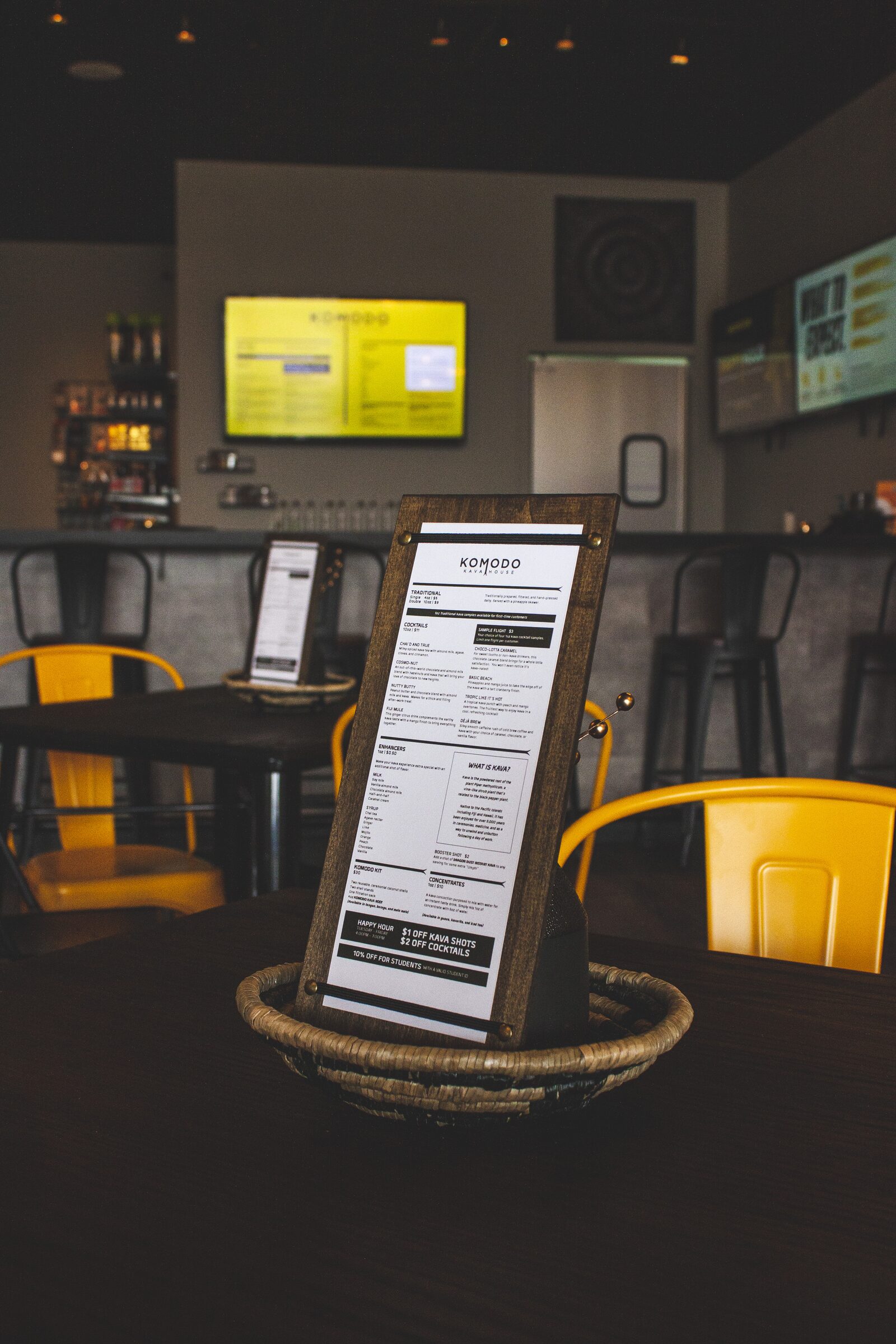
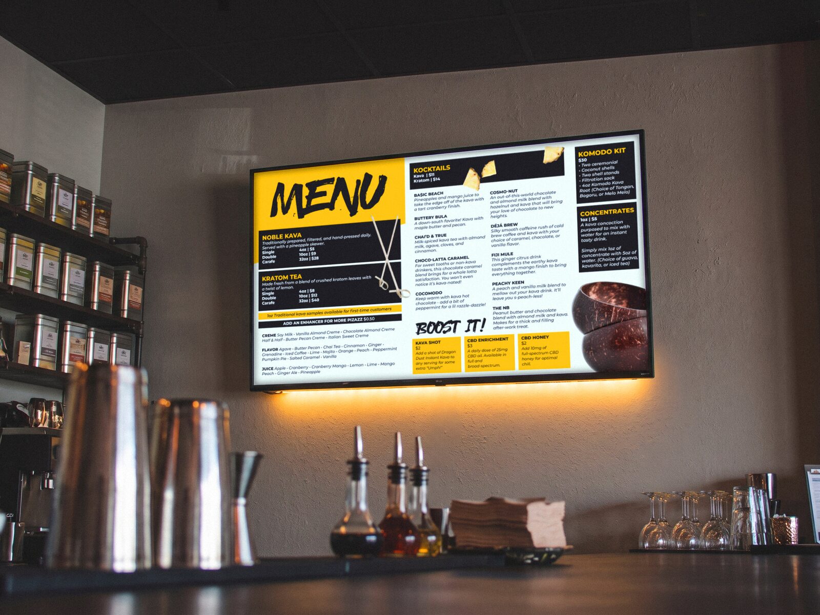
For the printed menu, I gave myself one restriction: everything on a single side. I didn't want menus lying loose around the bar, so I mounted them on dark-stained wooden boards with elastic bands held by brass push-pins. Cheap, easy to make, and we could swap menus in and out whenever they got cruddy or needed updating. I also made a digital menu for the TVs behind the bar, which doubled as a backup whenever the printed ones weren't on hand.
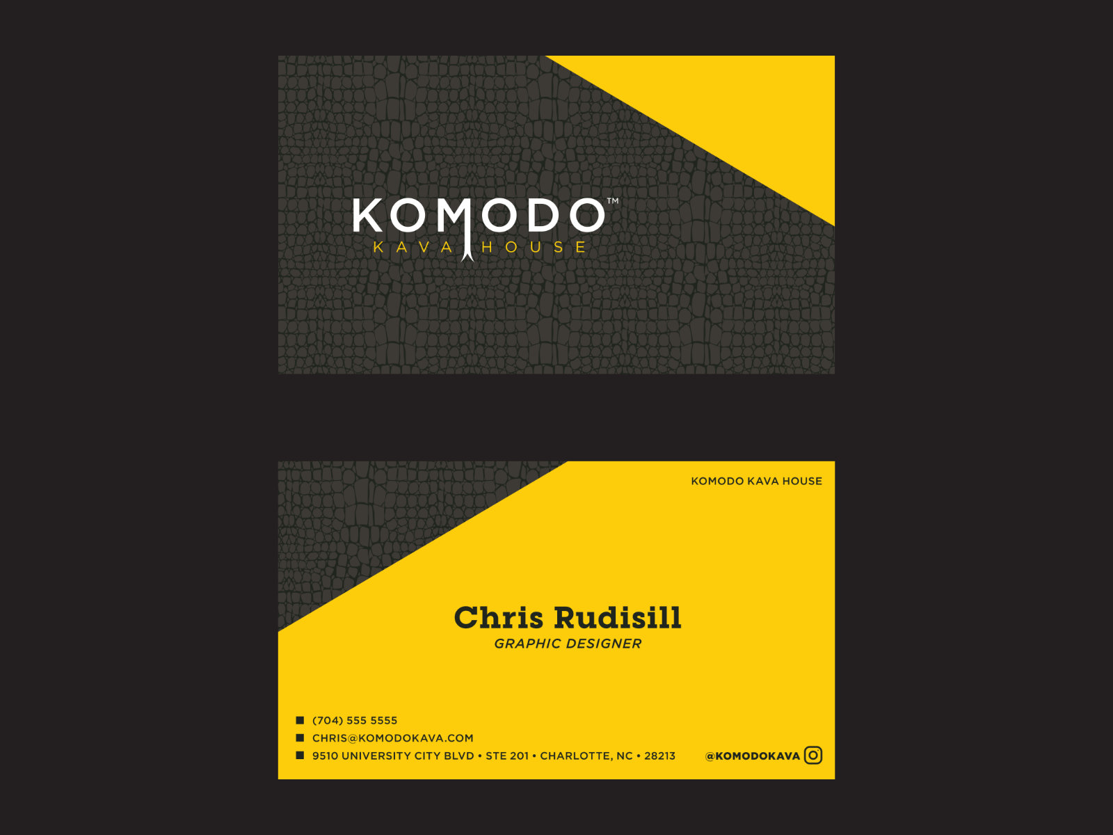
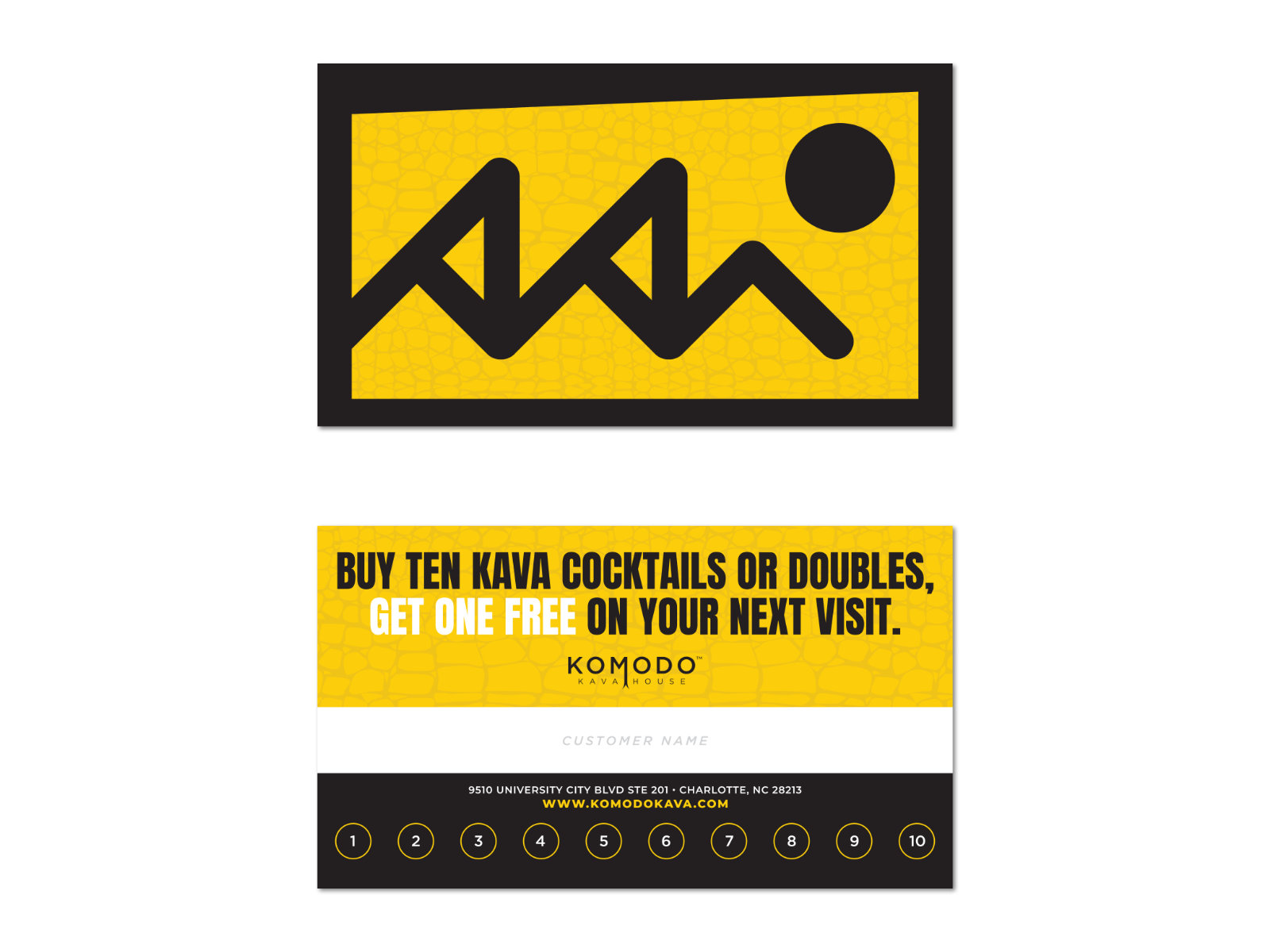
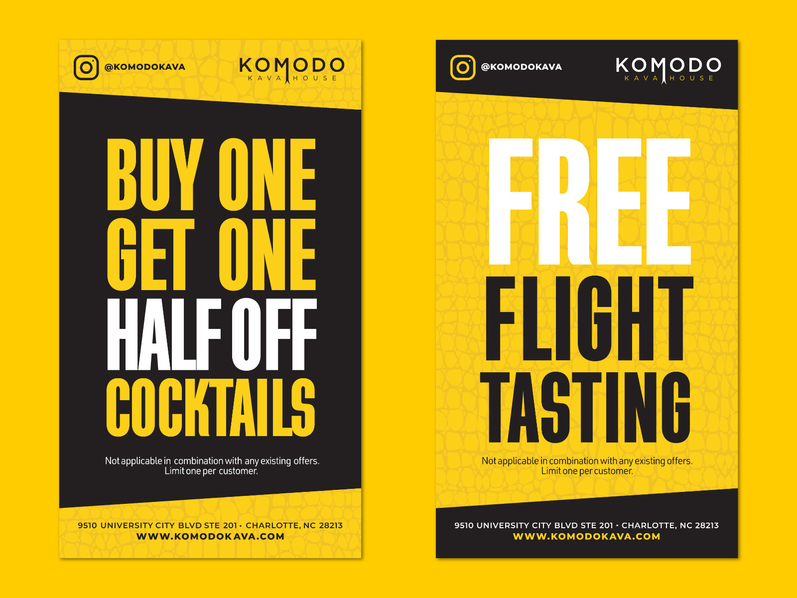
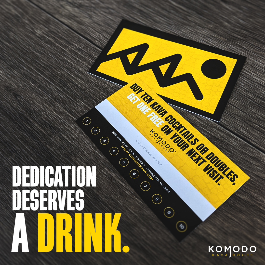
The rest of the print (business cards, coupons, punch cards) leaned hard on that yellow. It's an alarming color, so I paired it with clean hierarchy so nothing fought for attention. My favorite piece is the punch card: the lizard's teeth are made of the letters "KKH," a logo variant I pitched early on and snuck in here instead.
Social
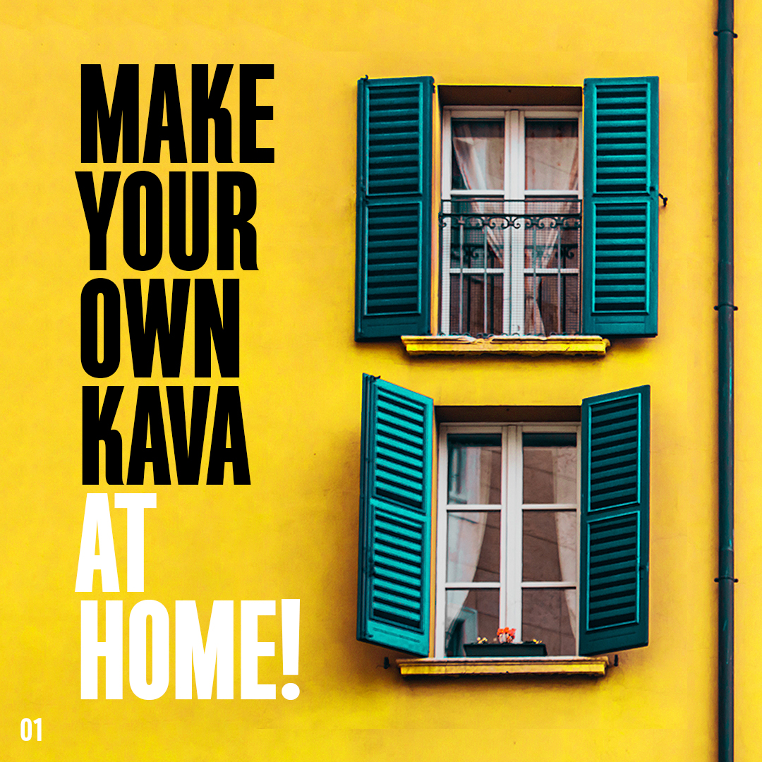
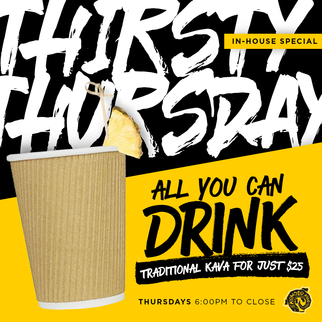
Social was mostly carousels, built to pull people to the next slide with small cues like a dot or a sliver of the next image peeking in.
Out of home
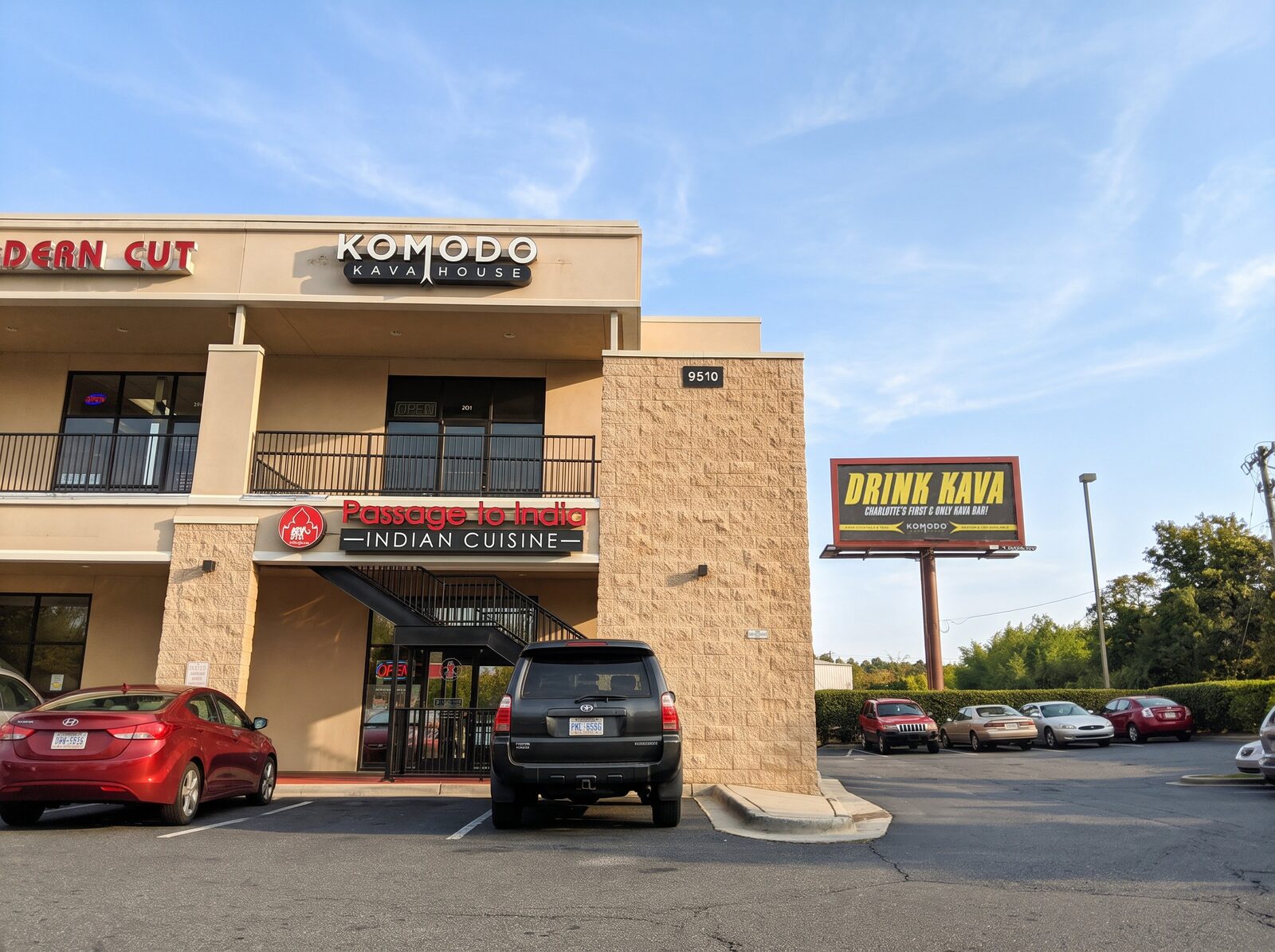
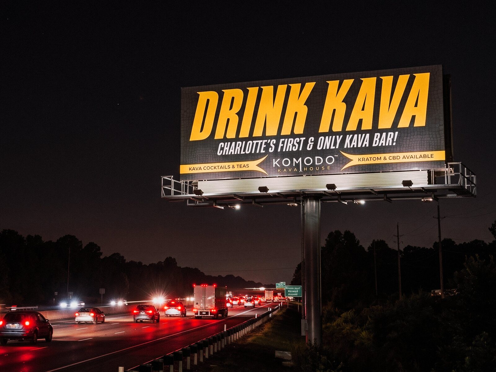
Billboards weren't new to me by this point, but this one was a chance to try something bold. As Charlotte's first kava bar, the concept needed to be shouted: big type, strong contrast, impossible to miss. Instead of making drivers work out a message or a call to action, the board gives them the word "kava" outright.
If you didn't know what it was, you'd wonder. If you did, you'd be excited to finally have a local spot for it.