objective.
Protagonist Beer reached out again this year and asked me to craft another promo package for their annual Arts & Drafts event. I never say no to projects I think are a good time, so here we go again.
They wanted to stay consistent with the design of 2021, but changing enough elements so that’s it’s not just a lazy rehash. At least, that’s the subtext I got from the initial discussion. PB is very much one of those clients who give you a simple “we need a thing” brief and leave you to come up with most the details.
solution.
Here’s one of the early joints I sent their way. It being an art-centric event, I had the idea of using a grade-school scribble theme for the design. Something akin to School of Rock, I guess. You can probably imagine the style; lots of sketchy-looking doodles sprawled everywhere. I thought that hand-drawn idea would’ve been cool. I also thought it would be clever to go with a blueprint-style palette to invoke yet another form of “draft”.
But they weren’t into it. What can ya do?
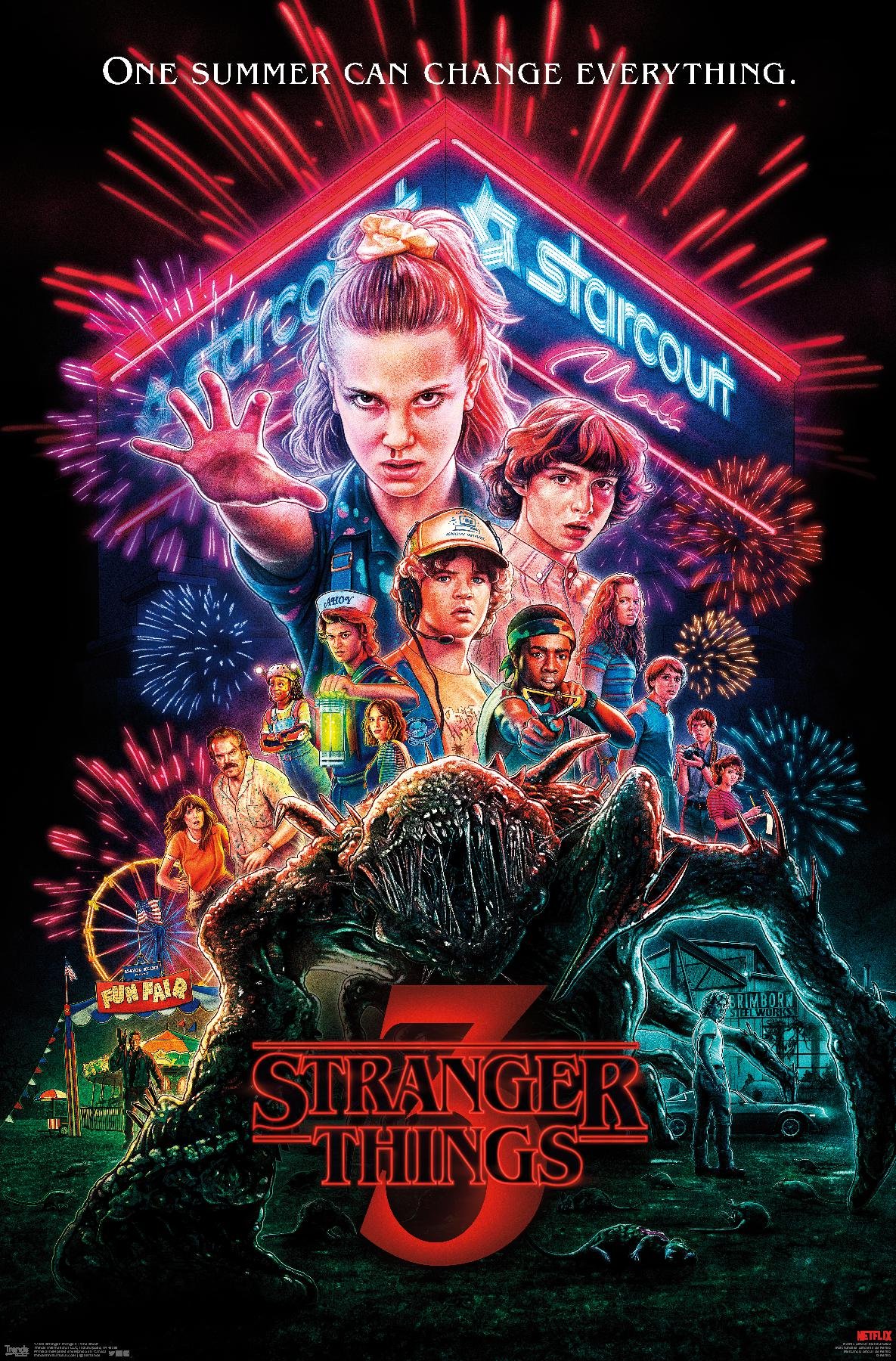
My contact started shooting over promo art from the show Stranger Things as “inspiration”. Not too sure what that meant exactly. I asked about particular elements they’d be interested in me replicating, but didn’t get too many solid answers in that regard. Whatever - I guess we’re gettin’ spooky.
So I really liked this heavy metal-inspired type that I was working with, and I wanted to keep that. So, after some recoloring and a lot of illustrating I landed on a collage similar to the previous year’s design. I still incorporated all of the gritty, scratchy aesthetics like I intended, and after some tweaks here and there we landed in a place that we were both happy with.


